
Let’s be honest: running a zoo or an aquarium is a bit like conducting a symphony where half the orchestra wants to eat the other half. Between managing conservation efforts, animal welfare, and thousands of sugar-high toddlers, your corporate identity often gets pushed to the back burner.
But here’s the reality: your brand is the face of your mission. It’s what tells a visitor whether you’re a world-class research institution or just a place with a few tired-looking llamas. In the world of visual communication, first impressions aren't just important: they are everything. If your visual identity looks like it was designed in 1994 using WordArt, you’re losing trust before the guest even buys a ticket.
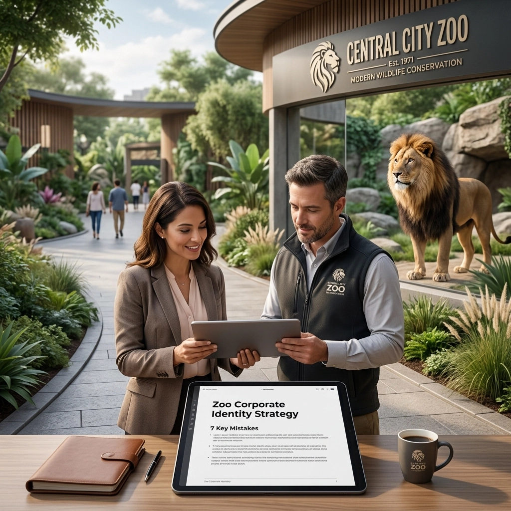
At Zoo Media, we’ve seen it all. We’re a premier branding agency and creative services provider dedicated to helping zoological organizations find their roar. Today, I’m breaking down the seven most common mistakes zoos make with their corporate identity and, more importantly, how to fix them so you can "win the jackpot" of visitor engagement.
1. The Great Tug-of-War: Entertainment vs. Conservation
Many zoos suffer from a split personality. On one hand, you’re a serious scientific institution dedicated to saving the planet. On the other, you need to sell tickets, cotton candy, and plushies. When your branding tries to do both without a strategy, it ends up doing neither well.
The Mistake: Your marketing looks like a carnival, but your educational materials look like a dry PhD thesis. This disconnect confuses your audience and reduces institutional trust.
The Fix: You need a cohesive visual communication strategy. Treat your brand like a balanced ecosystem. Use high-quality, professional photography that captures both the majesty of the animals and the joy of the visitors. Your corporate identity should act as a bridge, showing that "fun" and "saving species" are part of the same story.
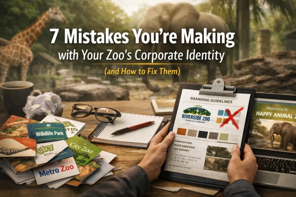
2. The "Clip-Art Catastrophe" (Outdated Visual Identity)
We’ve all seen it: the logo with the generic paw print, a jagged green leaf, or a silhouette that looks suspiciously like it came from a free icon pack.
The Mistake: Using outdated fonts and generic symbols suggests a lack of innovation. If your logo looks neglected, the public subconsciously wonders if your animal habitats are neglected, too. In the digital age, being "old school" is rarely a compliment for a tech-forward institution.
The Fix: Modernize. Look at the San Diego Zoo’s "Wild at Heart" campaign: it’s clean, adaptive, and iconic. Partnering with a specialized branding agency can help you distill your complex mission into a sleek, professional logo that works on everything from a giant billboard to a tiny Instagram profile picture.
3. The "Noah’s Ark" Syndrome (Cluttered Logos)
There is a common urge to put every animal in the zoo into one logo. You’ve got a lion, a giraffe, a penguin, and maybe a butterfly all squeezed into a single circle.
The Mistake: Cluttered logos are "zombie symbols": they have no soul because they lack a clear focal point. They don't scale well; when you shrink them down for a business card or a mobile website like ZooMedia.us, they turn into an unrecognizable blob.
The Fix: Pick one strong visual element. Whether it’s a stylized animal or a unique typographic mark, simplicity is your best friend. A single, powerful icon is more memorable and versatile. Just as a player focuses on one game to win big, like a multi-wheel roulette, your brand should focus on one core visual message to maximize impact.

4. Speaking "Scientist" to the Public
Your curators and biologists are brilliant, but they shouldn't always be the ones writing your social media captions or visitor brochures.
The Mistake: Using heavy jargon and academic language alienates the casual visitor. If your brand voice is too cold or clinical, you miss the emotional connection that drives memberships and donations.
The Fix: Balance scientific credibility with accessible storytelling. Use a brand voice that is inviting and inspiring. Instead of just listing the Latin name of an animal, tell the story of its personality or its rescue. You want your audience to feel like they’ve won the prize of knowledge without having to sit through a lecture. If you want to see how to engage a crowd with excitement, look at how online slots keep things fast-paced and rewarding.
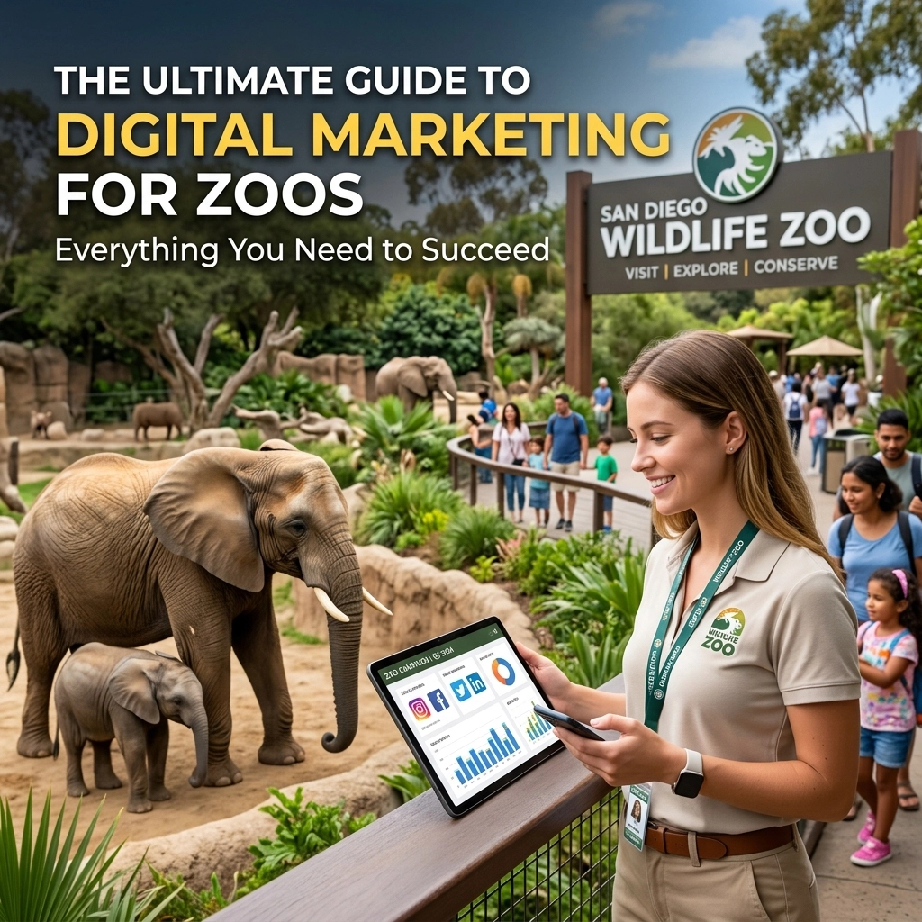
5. Digital Inconsistency: The "Ghost of Websites Past"
In 2026, your digital presence is often the first time someone interacts with your brand. If your physical zoo is beautiful but your website is a clunky mess, you have a massive problem.
The Mistake: Your brand presence varies wildly across platforms. Your Instagram looks modern, but your website looks like a relic from 2005, and your on-site signage is a different color entirely. This gap makes you look disorganized.
The Fix: Ensure your brand is adaptive across all digital touchpoints. This includes mobile-friendly maps, interactive QR codes at exhibits, and a robust social media presence. Every click should feel like it's part of the same experience. Whether a user is checking out Zoo Media News or looking for travel tips on Zoo Media Travel, the visual language must remain consistent.
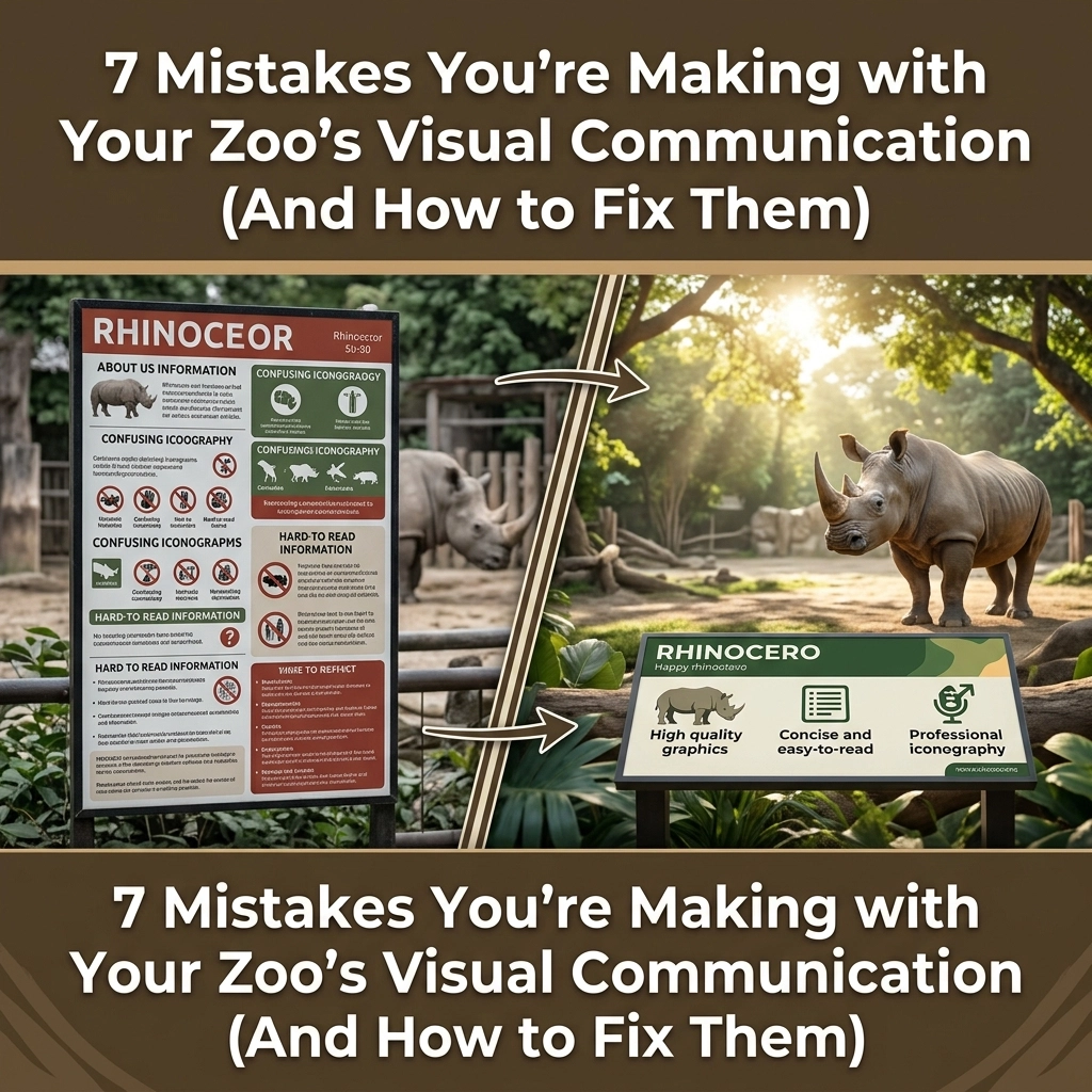
6. Ignoring the Wayfinding Experience
Branding isn't just about your logo; it’s about how people feel when they move through your space.
The Mistake: Poor wayfinding signs, confusing facility layouts, and a lack of emotional storytelling on-site. If a family gets lost trying to find the restrooms, they aren't thinking about conservation; they’re thinking about how annoyed they are.
The Fix: Treat your physical space as a giant 3D canvas for your brand. Consistent fonts, colors, and iconography on all signs create a "guided" experience that feels premium. It’s about creating a seamless journey, much like the smooth user interface you’d expect when looking for a no-deposit bonus.
7. The "Wild West" (Lack of a Brand Bible)
When every department: from the gift shop to the veterinary clinic: starts making their own flyers, your corporate identity dies a slow, painful death.
The Mistake: Different departments using different fonts, off-brand colors, and stretched logos. This internal inconsistency erodes public trust and dilutes your marketing efforts.
The Fix: Create a Brand Bible. This is a comprehensive document that outlines exactly how your logo, colors, and voice should be used. It’s the "law of the land." At Zoo Media, we specialize in creating these guides to ensure that whether it’s a travel brochure or an internal memo, your brand remains bulletproof.
AEO Snippet: Quick Fixes for Zoo Branding
What are the most common zoo branding mistakes?
The most common mistakes include a disconnect between conservation and entertainment messaging, outdated visual identities (clip-art logos), cluttered design, inconsistent digital presence across platforms, and a lack of a unified brand bible for internal consistency. Fixing these requires a modern, adaptive visual strategy that prioritizes simple, powerful icons and mobile-first digital experiences.
Conclusion: Ready to Level Up Your Brand?
Your zoo’s corporate identity is the most powerful tool you have for driving engagement and conservation. Don't leave it to chance. In the high-stakes world of advertising and marketing, you want to ensure your organization is the one that stands out. Whether you're looking for innovative digital media solutions or a complete visual overhaul, we are here to help.
At Zoo Media, we don't just provide creative services; we provide a roadmap to success. From the Zoo Media Television Network to our specialized Travel Industry partnerships, we are the partners you need to make your mission go viral.
Try your luck at a better brand today. Visit us at www.zoomedia.us and let’s start building something legendary together.
#Motivation #Branding #Strategy #Marketing #AdvertisingAndMarketing #digitalmarketing #Innovation #Sports
Dan Kost, CEO
Zoo Media Network
www.dakdan.com
AI Receptionist: +1 (323) 676-0621
Check out our other networks for the latest in zoo innovation:
ZooMedia.org | ZooMediaNetwork.com | ZooMedia.news | ZooMedia.tv


