Let’s be honest: visitors don't come to your zoo just to see an elephant. They come for the experience. They want to be transported to another world, to feel the thrill of conservation, and, let’s face it, to find the nearest restroom without a twenty-minute safari through the gift shop.
In the high-stakes world of zoo and aquarium management, your visual communication is the silent ambassador of your brand. It’s what tells a family they’re in a place of wonder and tells a corporate sponsor they’re in a place of professional opportunity. But far too often, brilliant conservation efforts are buried under bad fonts, cluttered signs, and outdated "clip-art" aesthetics.
If you’re a brand manager or a creative director, you know that visual identity isn’t just about a pretty logo. It’s about strategy. Are you making these common mistakes? Don't worry, we’ve got the fixes. Discover your luck in the world of smart venues and let's turn those visual "don'ts" into "dos"!
1. The Generic "Clip-Art" Identity
We’ve all seen it: the generic paw print logo or the stock silhouette of a lion that could belong to any zoo from Boise to Berlin. When your branding is generic, your institution becomes interchangeable.
The Mistake: Using "off-the-shelf" visuals that lack a unique story or local connection. This weakens your corporate identity and makes it harder for visitors to form an emotional bond with your specific animals and mission.
The Fix: Invest in professional creative services to build a custom visual identity. Your logo should be simple enough to scale down to a tiny mobile icon but unique enough to stand out on a billboard.
- Pro Tip: Use colors inspired by your specific habitats, think deep oceanic blues for aquariums or earthy savanna oranges.
- Action: Audit your logo today. If it looks like it was made in 1995 using Microsoft Paint, it’s time for a refresh!
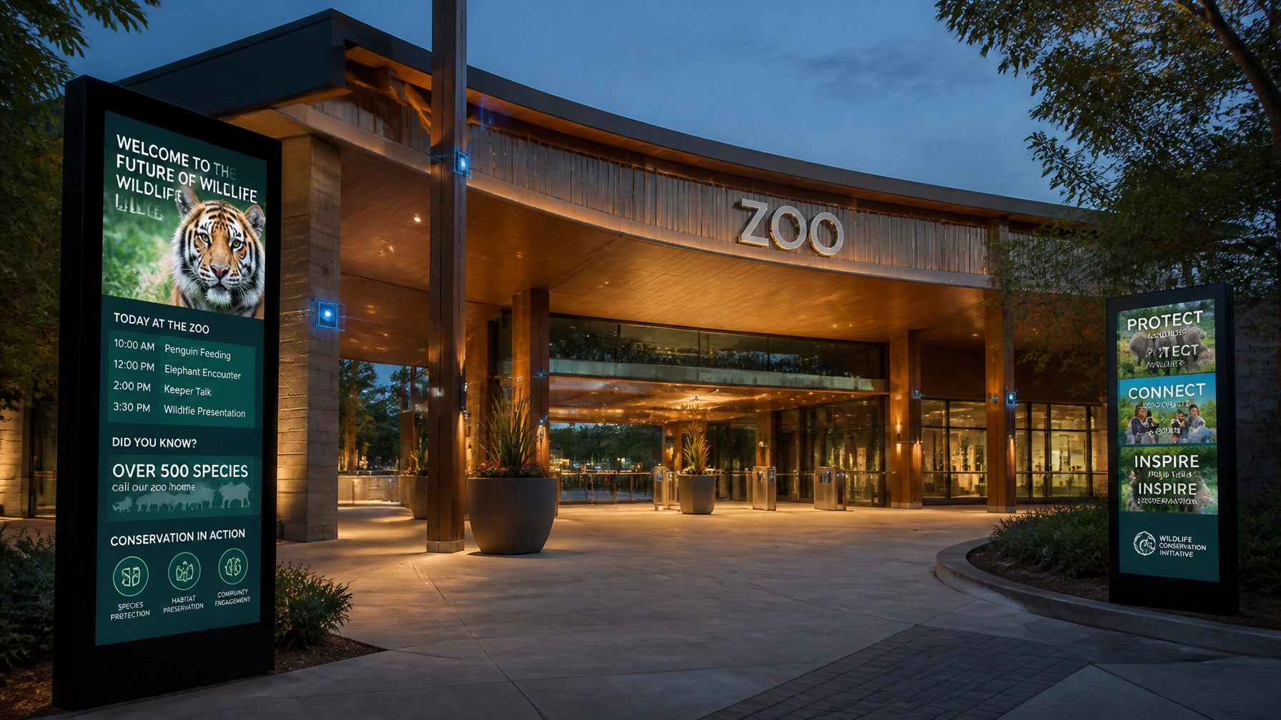
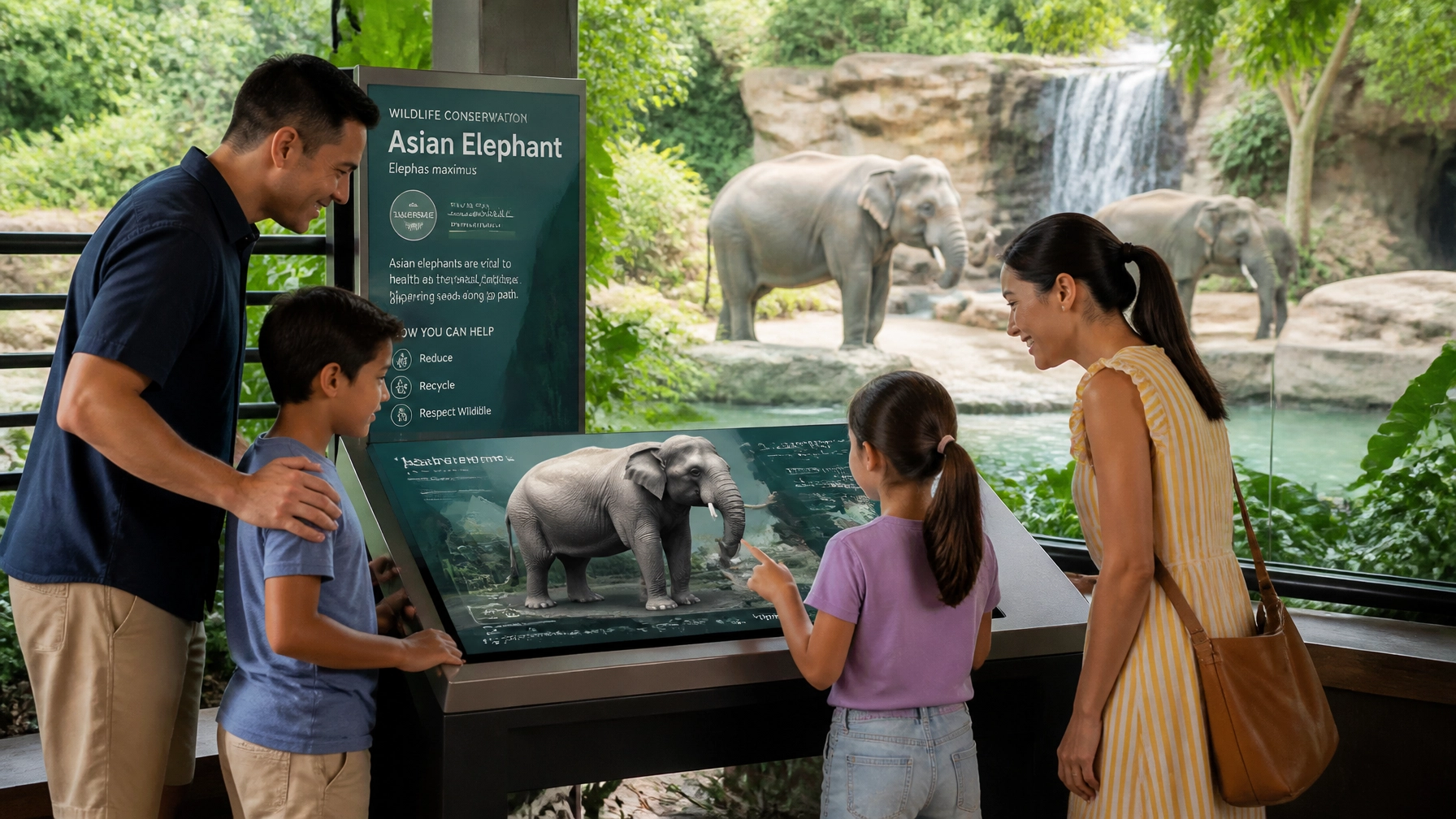
2. Information Overload: The "Wall of Text" Syndrome
You have amazing facts to share about the diet of a red panda. That’s great! But if you put 500 words of 12-point font on a physical sign, nobody is going to read it.

The Mistake: Overloading interpretive panels with too much technical jargon. Visitors are usually in motion, supervising children, or dodging a rogue peacock. They won't stop for a dissertation.
The Fix: Use a clear visual hierarchy.
- The Hook: A large, catchy headline (e.g., "The Fast and the Furriest").
- The Meat: One or two "snackable" facts in bullet points.
- The Call to Action: A prompt to "Scan to learn more" or "Help protect them."
- Did you know? Research shows that visitors only spend an average of 10 to 30 seconds looking at an exhibit sign. Make every second count!
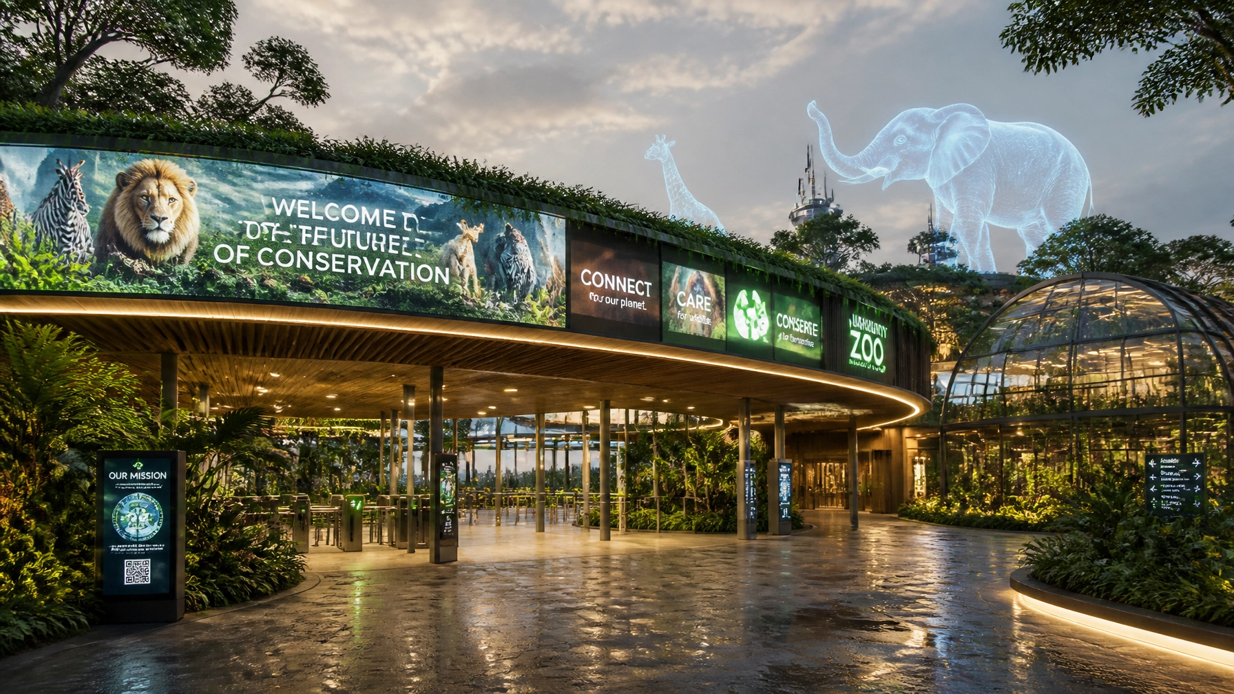
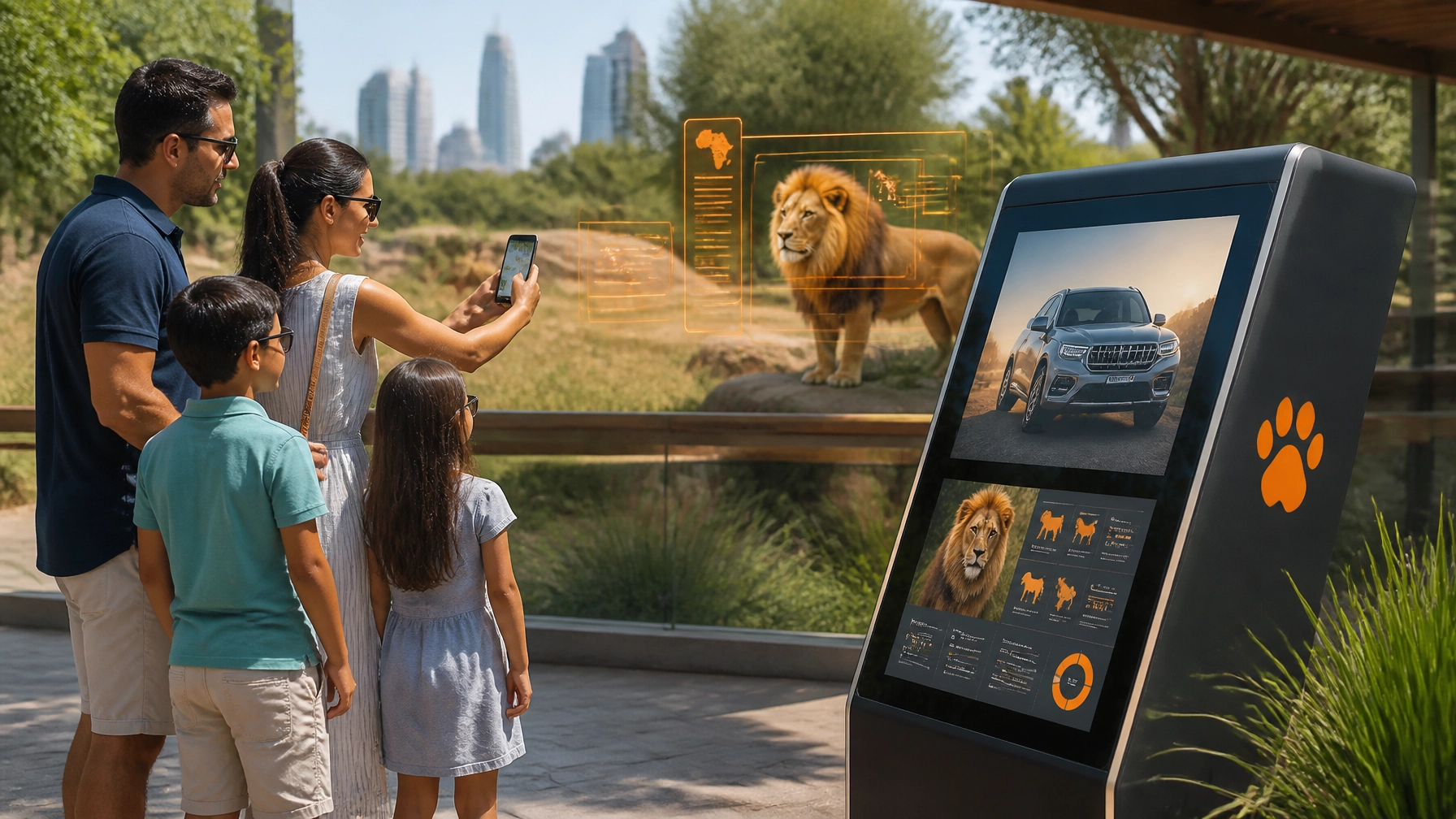
3. Wayfinding Failures: Where the Wild Things Get Lost
There is nothing that kills the "magic" of a zoo faster than a family getting lost. Confusing maps and inconsistent directional signs lead to "visitor fatigue," which means they’ll leave earlier and spend less at your concessions.
The Mistake: Using different icons for the same thing (e.g., a "burger" icon on the map but a "fork and knife" icon on the actual sign).
The Fix: Create a unified wayfinding system. Use consistent symbols, fonts, and colors across all touchpoints.
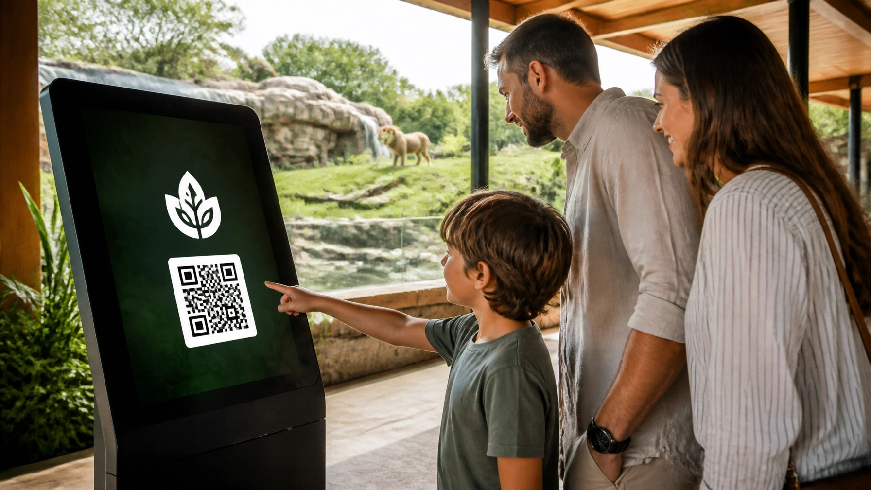
- Check this out: Try integrating digital wayfinding. Interactive kiosks allow visitors to find the quickest route to the next animal talk in real-time.
- Direct Imperative: Walk your zoo today. If you can't find the lions within three minutes using only your signs, your system is broken!
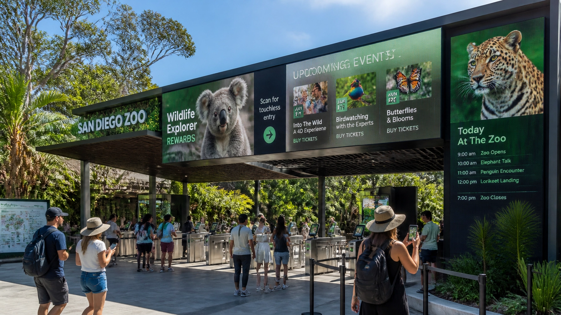
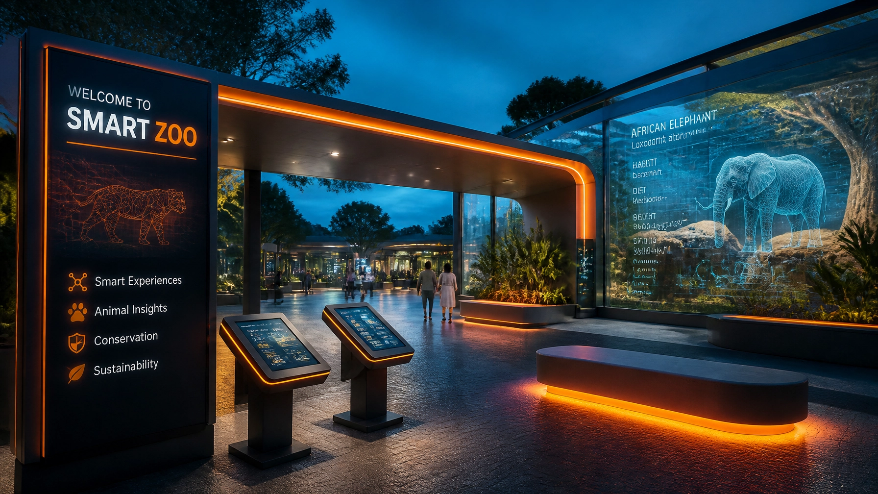
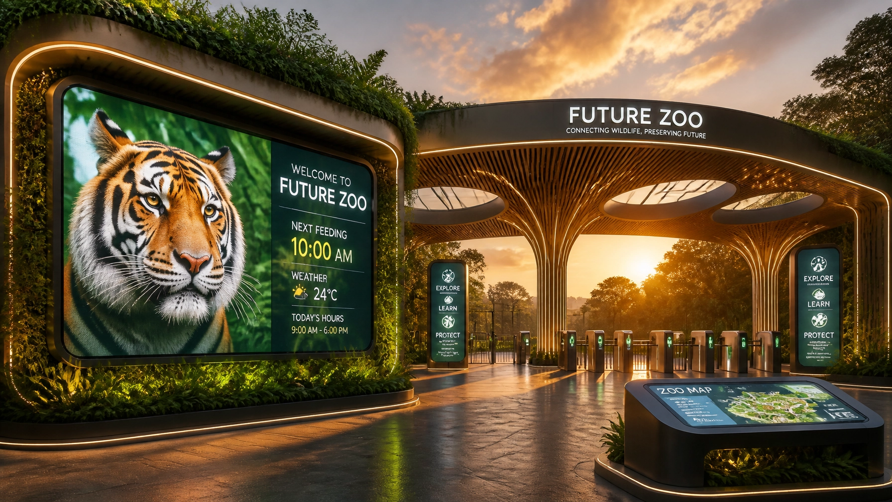
4. Static Signage in a Digital-First World
If your signs are still made of static wood or plastic, you're missing out on the flexibility of the modern age. How do you update a sign when a new animal is born or an exhibit is temporarily closed for maintenance?

The Mistake: Relying solely on physical signage that is expensive to replace and impossible to update instantly.
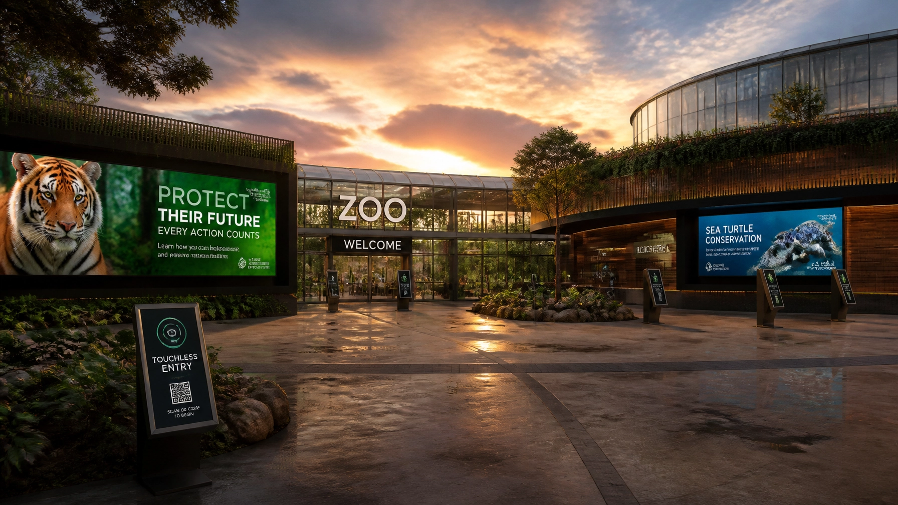
The Fix: Embrace the Smart Zoo concept. By using the Zoo Media Television Network, you can stream live updates, educational videos, and urgent conservation news across your venue.
- The Advantage: Digital signage allows for "day-parting." Show breakfast specials on your screens in the morning and membership renewal reminders in the afternoon.
- Bonus: They're all rather rare, these high-tech systems, but they provide a modern "wow" factor that static signs just can't match.
5. Neglecting the Human Connection
Zoos are about animals, yes, but they are also about the people who care for them. Many visual communications focus 100% on the species and 0% on the keepers, researchers, and educators.
The Mistake: A lack of "human" elements in your photography and video content. People connect with people.
The Fix: Incorporate your staff into your visual storytelling. Show a keeper feeding a giraffe or a veterinarian performing a check-up.
- Engagement Tip: Use QR codes on signs that lead to "Meet the Keeper" videos. It adds a layer of transparency and trust to your conservation mission.
- Try your luck: Feature a "Keeper of the Month" on your digital screens and watch how visitors start looking for them to ask questions!
6. Brand Schizophrenia: Inconsistency Across Departments
Does your marketing team’s Instagram look like a high-fashion magazine while your on-site education department’s handouts look like a high school science project? This "brand schizophrenia" confuses visitors.
The Mistake: Allowing different departments to create their own visual materials without a central style guide. This creates "speedbumps" in the visitor experience.
The Fix: Develop a comprehensive Brand Style Guide. This document should specify:
- Logo usage: (Never stretch the logo!)
- Typography: Which fonts are for headlines and which are for body text.
- Color Palette: Exact hex codes for your brand colors.
- Tone of Voice: Is your zoo "adventurous and bold" or "calm and educational"?
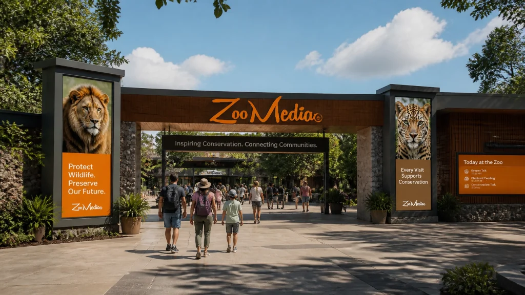
- Direct Action: Ensure every department has access to a shared library of approved assets. Check out the Zoo Media brand assets for inspiration on how to keep things tight and professional.
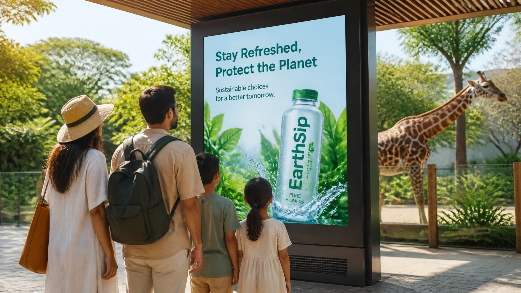
7. Leaving Sponsor ROI on the Table
Corporate sponsors aren't just looking to put their logo on a fence. They want to be part of an innovative, high-tech environment that aligns with their own brand values.

The Mistake: Offering "boring" sponsorship opportunities like static banners that get ignored by visitors.
The Fix: Offer unique corporate sponsorships through Zoo Media. By using digital displays and interactive kiosks, you can offer sponsors high-visibility, high-engagement placements.
- The Math: Digital ads have a significantly higher recall rate than static ones. By providing sponsors with data-driven results (like "Your ad was seen by 5,000 visitors today"), you increase the value of your partnerships.
- Call to Action: Elevate your sponsor game. Don't just sell a sign; sell a strategic partnership that enhances the visitor experience!
Conclusion: Time for a Visual Audit!
Your zoo is a place of incredible stories. Don’t let those stories get lost in a sea of bad design and outdated technology. By fixing these seven mistakes, you can enhance the visitor experience, promote animal welfare, and drive higher revenue through smarter sponsorships.
At Zoo Media, we specialize in assisting zoos and aquariums around the globe in becoming smart venues. Our innovative thinking and high-tech creative marketing services are designed to make you an invaluable strategic partner in the world of conservation and education.
Ready to level up your visual communication?
Explore our services and see how we can help you lead the way in zoo innovation. Prova la tua fortuna al casinò of innovation and win the biggest prize: a happy, engaged, and returning visitor base!
#Motivation #Branding #Strategy #Marketing #AdvertisingAndMarketing #digitalmarketing #Innovation #Sports
Zoo Media
Innovative thinking for smart venues.
www.zoomedia.us | www.dakdan.com
AI Receptionist: +1 (323) 676-0621
Dan Kost, CEO