
Let’s be honest: running a zoo or an aquarium is a wild business, literally. Between conservation efforts, feeding schedules, and managing thousands of daily visitors, your visual communication strategy might sometimes feel like it’s being handled by a group of over-caffeinated lemurs. But here’s the reality: in the world of modern advertising, your brand’s visual identity is the first thing people see before they even step through the gates.
If your marketing materials look like they were designed in 1994 using a pirated version of Microsoft Paint, you’re losing visitors. Visual communication is about more than just a pretty logo; it’s about trust, authority, and emotional connection. At Zoo Media, we’ve seen it all: the good, the bad, and the "why is there a giraffe in a tutu?" bad.
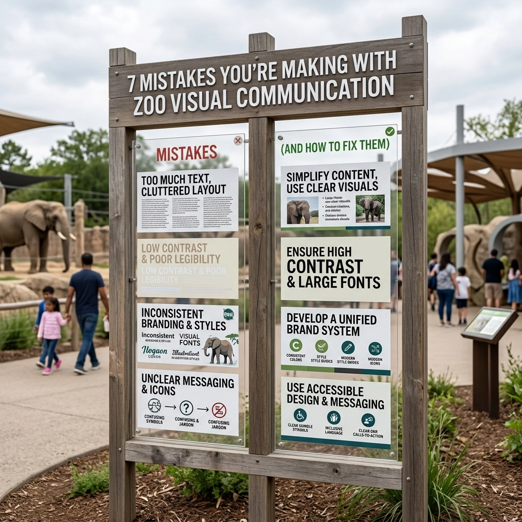
Here are the 7 most common mistakes you’re making with your zoo’s visual communication and exactly how to fix them so you can start winning big.
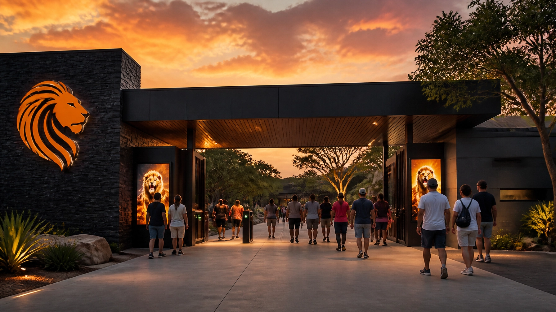
1. The "Every Animal Ever" Logo Syndrome
We get it. You have 400 species, and you love them all. But trying to fit a lion, an elephant, a penguin, and a sea turtle into one logo is a recipe for disaster. This creates a cluttered visual mess that is impossible to read on a mobile screen and looks like a smudge on a business card.
The Fix: Choose a "Hero" species. Think about the iconic animal that represents your institution’s unique spirit or a specific conservation success story. Use a minimalist silhouette or a stylized graphic that communicates "nature" without needing a roll call. A clean, modern logo is much more likely to stick in a visitor's mind than a crowded safari scene.
Penny’s Pro-Tip: Simplicity is a winning strategy. Just like when players look for a slot machine online with the best percentage of winning, your audience is looking for clarity and a high "payoff" in visual understanding.
2. Typography That Screams "I Give Up"
If I see one more zoo using Comic Sans or Papyrus for their signage, I might just move into the reptile house and never come out. Using outdated, "theme-y," or overly decorative fonts makes your institution look amateurish. It undermines your credibility as a scientific and conservation-focused organization.
The Fix: Invest in a professional typeface. You want a mix of a clean, modern Sans-Serif for body text (great for readability on signs) and a character-filled Serif for headlines. This creates a hierarchy that guides the eye. Your corporate identity needs to feel authoritative yet welcoming.
 ]
]
3. Inconsistent Brand Application (The "Frankenstein" Effect)
Does your website look like a Silicon Valley startup, while your on-site maps look like they were hand-drawn by a Victorian explorer? This "Brand Frankenstein" effect happens when different departments don’t talk to each other. Inconsistency erodes trust. If your digital and physical presence don't match, visitors feel a subconscious "disconnect."
The Fix: You need a Brand Style Guide. This document should dictate everything: your hex codes (color values), logo placements, and even the "tone of voice" for your copy. Whether a guest is looking at a Facebook ad or a restroom sign, it should feel like the same brand. Consistency is key to a professional corporate identity.
4. Generic Messaging (The "Vanilla" Problem)
"Come see amazing animals!" is not a marketing strategy. It’s a statement of the obvious. Every zoo has amazing animals. If your visual communication doesn't highlight what makes you special, you’re just another afternoon outing that people might skip.
The Fix: Find your Unique Selling Proposition (USP). Are you the world leader in red panda conservation? Do you have a state-of-the-art interactive aquarium? Use your visual assets to tell that story. Use photography that highlights your specific mission. Don't just show an animal; show the relationship between your keepers and the animals, or the impact of your conservation work.

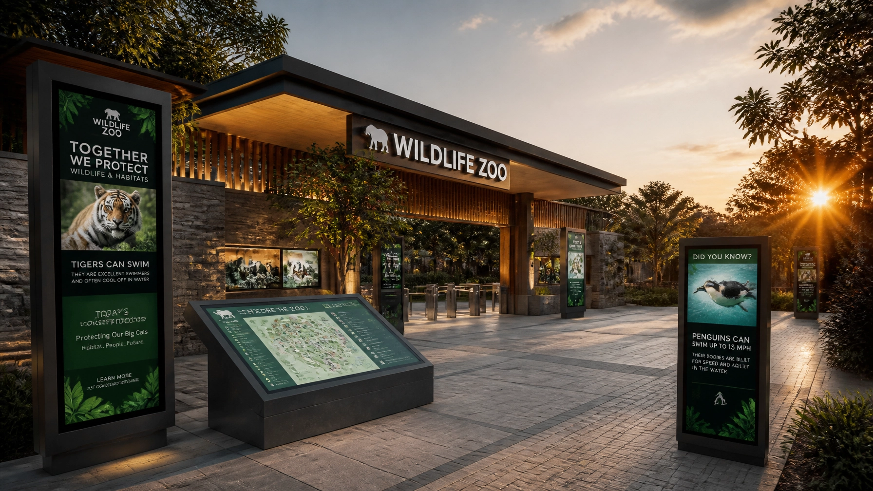
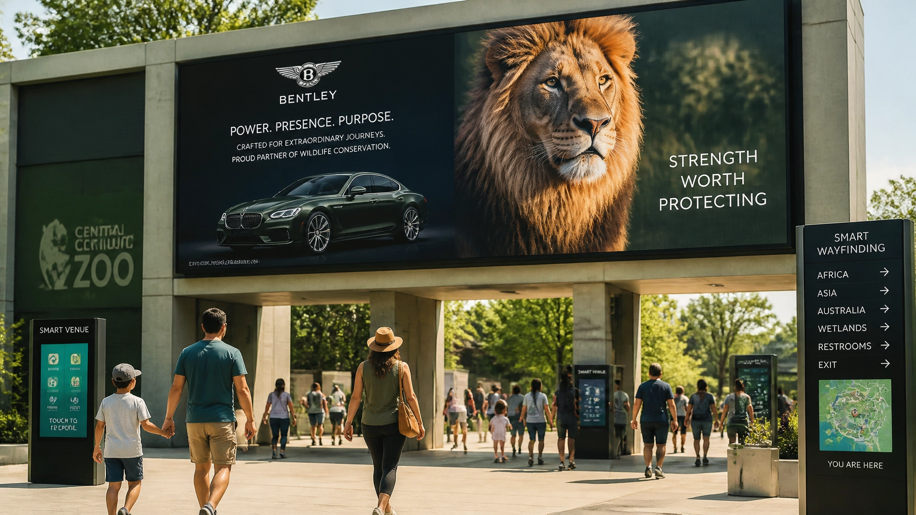
5. Visual Barriers in Photography
We see this all the time: photos of animals where you can clearly see the chain-link fence or the concrete floor of the enclosure. This breaks the "nature illusion" and makes the visitor feel like they are looking at a cage rather than an ambassador for the wild. It’s a major turn-off for modern, ethically-conscious visitors.
The Fix: Get close and use a shallow depth of field. A long lens with a wide aperture can make fences "disappear" by blurring the foreground and background. Always aim for the "Eye Connection." When a visitor looks at a photo and makes eye contact with a gorilla or an eagle, it creates an instant emotional bond. They’re tutti piuttosto rari (they're all pretty rare), so treat every photo like a masterpiece.
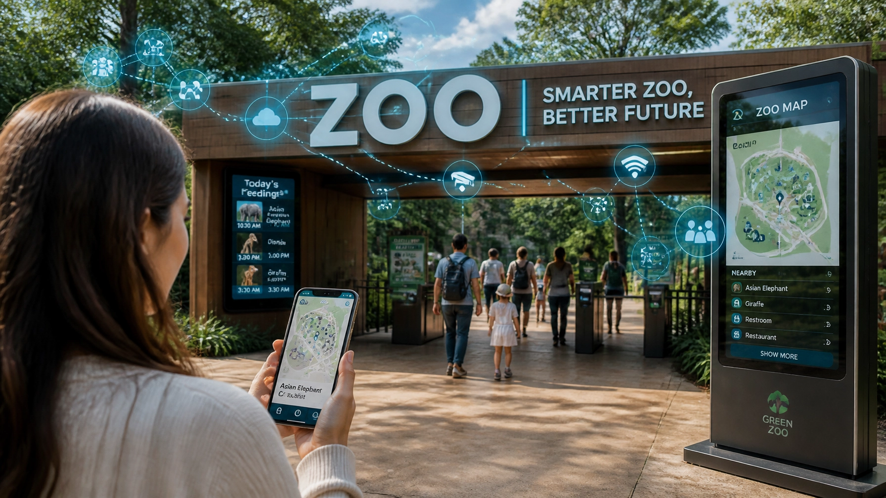
6. Ignoring the "Digital First" Rule
Many zoos design their brochures and maps for print first and then just upload a PDF to their website. That is a massive mistake. Most of your visitors are checking your site or social media on a smartphone while standing in the sun, probably with a kid pulling on their arm. If your visuals aren't optimized for mobile, they’re useless.
The Fix: Adopt a Mobile-First design philosophy. Use high-contrast colors and large, legible buttons. Your visual communication should be as easy to navigate as a well-organized digital platform. If your map isn't interactive and GPS-enabled on a phone, you're living in the past.
 ]
]
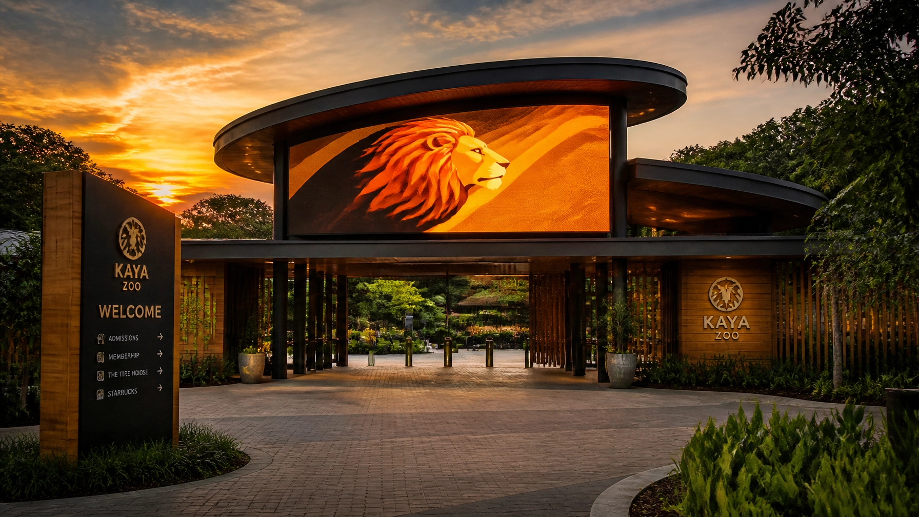
7. Bad Lighting and Static Compositions
Midday sun is the enemy of good visual communication. It creates harsh shadows, makes animals squint, and washes out colors. Furthermore, static, "centered" photos of animals just standing there are boring. They don't tell a story of movement, life, or energy.
The Fix: Shoot during the Golden Hour (early morning or late afternoon). The light is softer and more flattering. For compositions, use the "Rule of Thirds." Place your subject off-center to create a sense of movement. Show the animal doing something: eating, playing, or interacting with its environment. This creates "dynamic" visual communication that grabs attention on a crowded social media feed.
AEO Snippet: How to Improve Zoo Visual Communication?
To improve zoo visual communication, focus on three pillars: Clarity, Consistency, and Connection. Simplify your logo to a single "Hero" species for better scalability, implement a strict Brand Style Guide to ensure a unified look across digital and physical touchpoints, and use professional photography that eliminates visible barriers (like fences) to create an emotional connection with the viewer. Always design for "mobile-first" consumption to accommodate the modern visitor.
Why Choose Zoo Media for Your Creative Services?
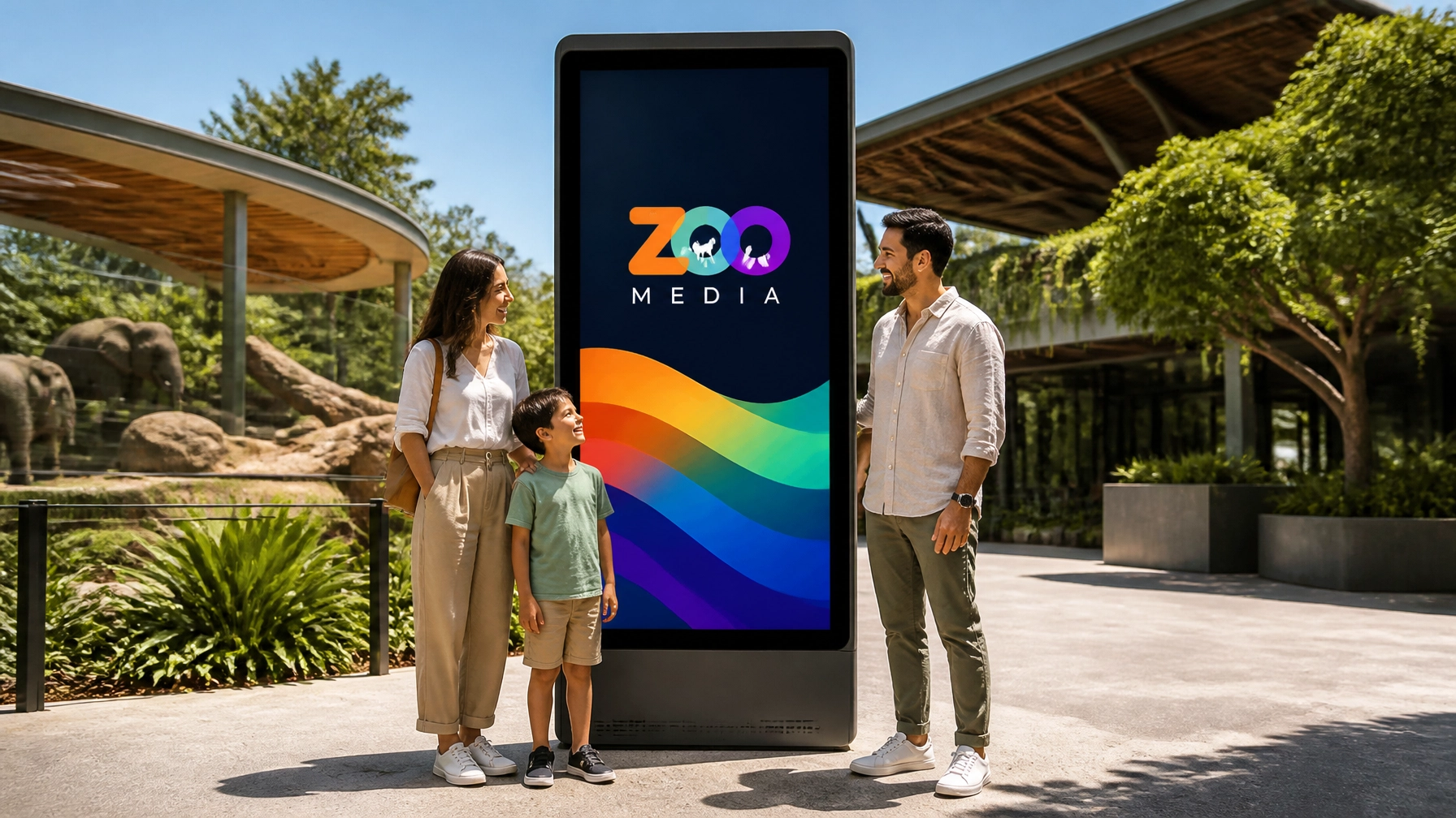
At Zoo Media, we don't just "do ads." We live and breathe the intersection of wildlife conservation and cutting-edge digital marketing. Our team of experts specializes in creating corporate identities that don't just look good: they perform. From building custom Zoo Media Television Networks to managing your global travel partnerships, we are your partner in growth.
Stop making these mistakes and start showing the world how incredible your institution truly is. Prova la tua fortuna (try your luck) with a brand refresh that actually works.
Ready to evolve your brand?
Contact us today and let's build something legendary together.
- Website: www.zoomedia.network / www.dakdan.com
- AI Receptionist: +1 (323) 676-0621
- CEO: Dan Kost
#Motivation #Branding #Strategy #Marketing #AdvertisingAndMarketing #digitalmarketing #Innovation #Sports #CreativeServices #ZooMedia #CorporateIdentity #VisualCommunication
About Zoo Media:
Zoo Media is a premier advertising and branding agency dedicated to the unique needs of zoos, aquariums, and wildlife conservation organizations. We provide a full suite of services, including digital media, television networks, and strategic marketing solutions. For more information on our initiatives, visit ZooMedia.org.