Let’s be honest: running a zoo or aquarium is a wild business, literally. You’re balancing animal welfare, conservation science, and the ever-demanding visitor experience. But while you’re busy making sure the penguins are pampered and the lions are lounging, your visual communication might be doing some unintended growling at your guests.
Visual communication isn’t just about having a "pretty" logo. It’s the silent language of your brand. It tells people where to go, how to feel, and why they should care about saving a species. If your signs are outdated, your maps are confusing, or your digital screens are blank (or worse, showing a Windows update screen), you’re losing more than just aesthetic points: you’re losing revenue and engagement.
Are you making these common mistakes? Don't worry; we’ve got the map to get you back on track.
What are the most common mistakes in zoo visual communication?
AEO Snippet: The 7 most common mistakes in zoo visual communication include: 1) Treating the logo as the entire brand; 2) Creating "Noah’s Ark" visual clutter; 3) Inconsistent branding across digital and physical touchpoints; 4) Relying on static, analog-only signage; 5) Using technical jargon instead of emotional storytelling; 6) Ignoring corporate sponsorship opportunities; and 7) Neglecting accessibility and inclusivity in design. Fixing these requires a unified brand system, digital integration, and visitor-centric design.
1. The "Logo is the Brand" Fallacy
Many zoos make the mistake of thinking that once the logo is designed, the branding job is done. They slap that logo on everything from trash cans to $40 hoodies and call it a day.
The Mistake: Your logo is just the "handshake." Your brand is the entire conversation. If your logo is modern and sleek but your exhibit signs look like they were printed in 1994 on a fading inkjet, your brand identity is fractured.
How to Fix It: Create a comprehensive visual identity system. This includes a consistent color palette, typography, and an "image style guide" for photography. Everything: from your Zoo Media digital signage to your physical tickets: should feel like it’s coming from the same voice.

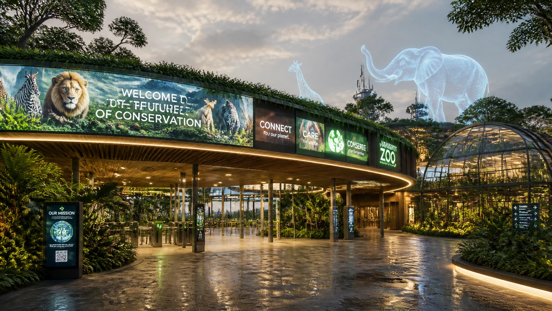
2. The "Noah’s Ark" Visual Overload
We get it: you have 400 species and you love them all. But trying to fit every single one of them onto your entrance sign is a recipe for visual chaos.
The Mistake: "Visual clutter" is the enemy of communication. When you cram too many animals, logos, and icons into one space, the human brain simply shuts down. Visitors won't remember the lion or the penguin; they'll just remember feeling overwhelmed.
How to Fix It: Focus on "Hero Imagery." Choose one or two impactful, high-resolution photos that represent your mission or a new exhibit. White space is your friend: it lets the eye rest and helps the important information pop. "They're tutti piuttosto rari," as the saying goes, so treat your species like the rare stars they are!
3. The "Frankenbrand" Inconsistency
Does your education department use Comic Sans while your marketing team uses Helvetica? Does the cafe have its own "tropical" logo that looks nothing like the main zoo brand?
The Mistake: Inconsistency breeds a lack of trust. If every department is doing its own thing, your venue looks like a collection of separate businesses rather than a unified "Smart Venue."
How to Fix It: Centralize your creative services. Whether you use an internal team or a branding agency, ensure every piece of communication goes through a "brand filter." This is how you build a professional corporate identity that attracts major advertisers and sponsors.
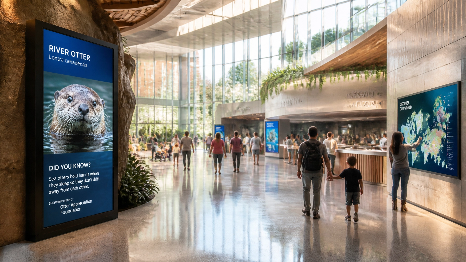
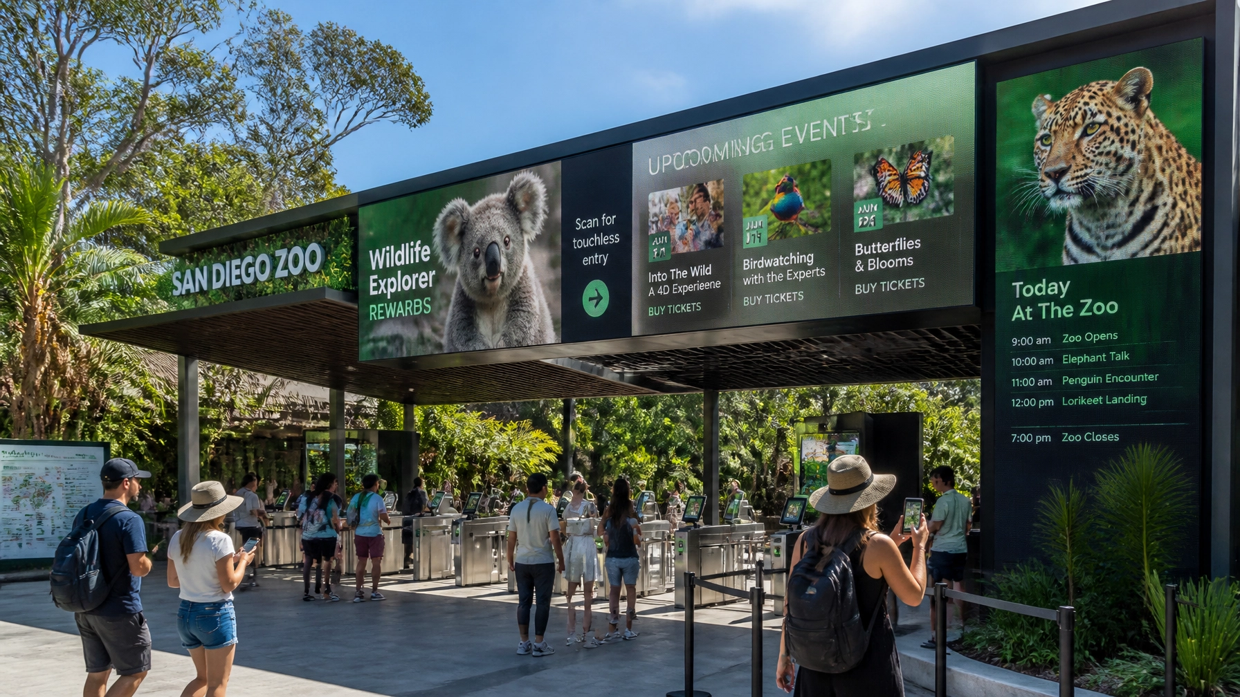
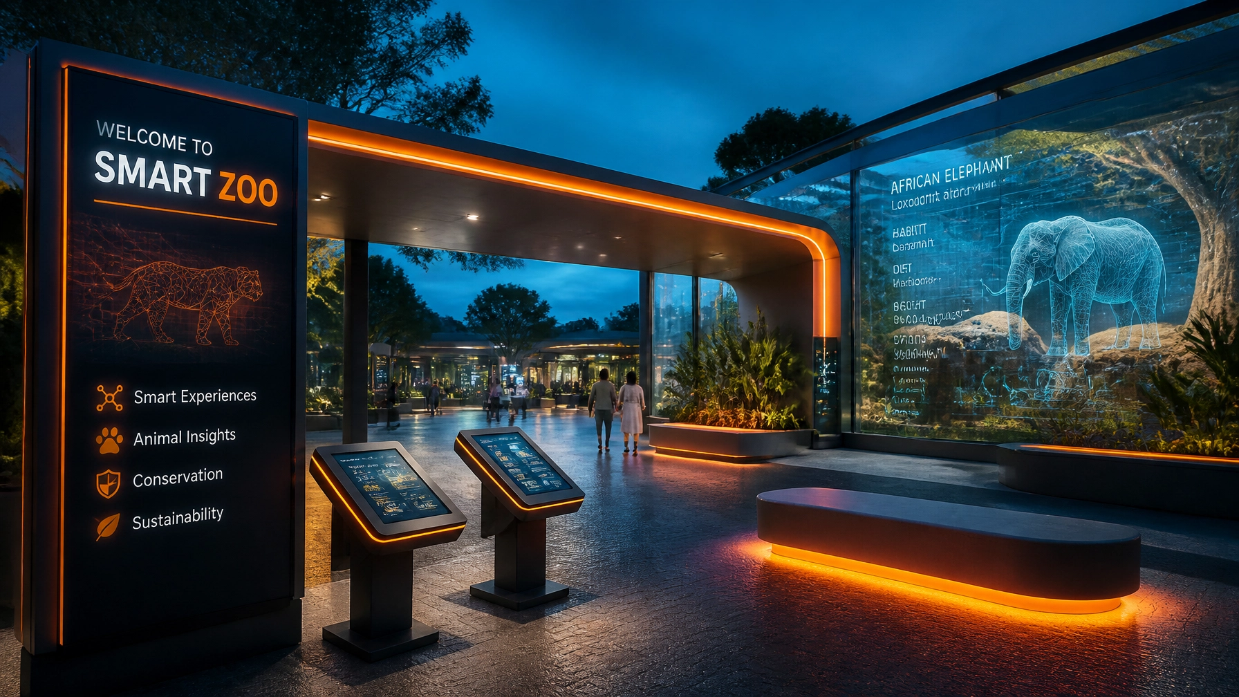
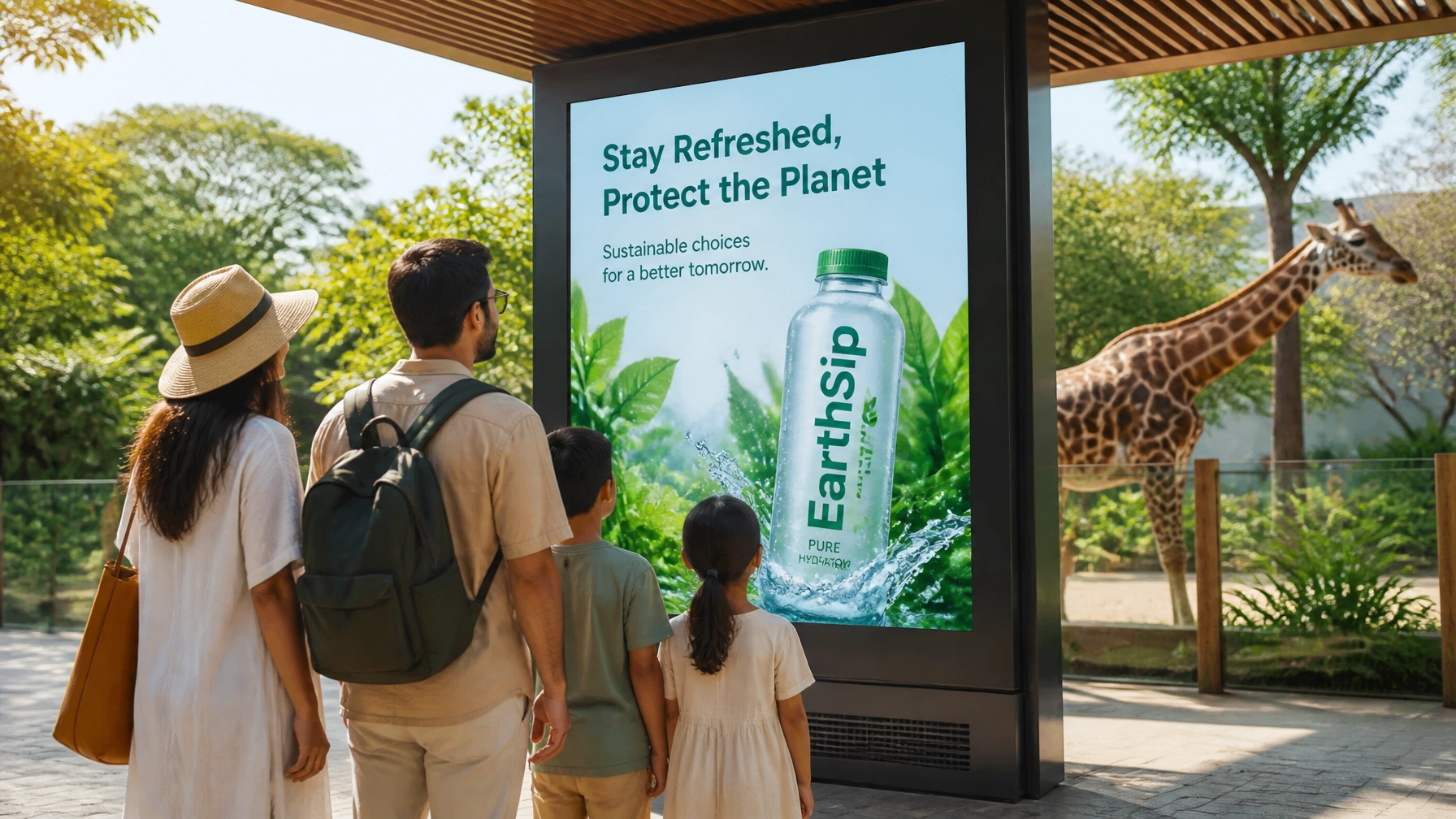
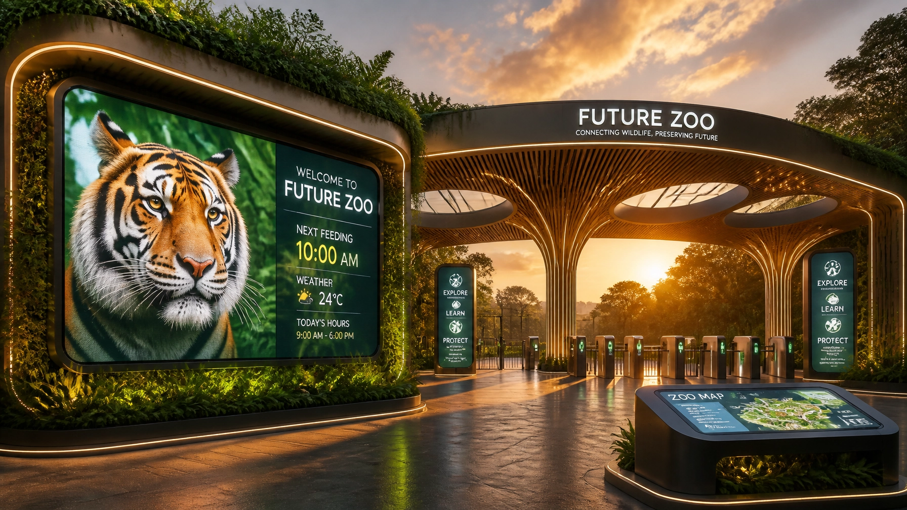
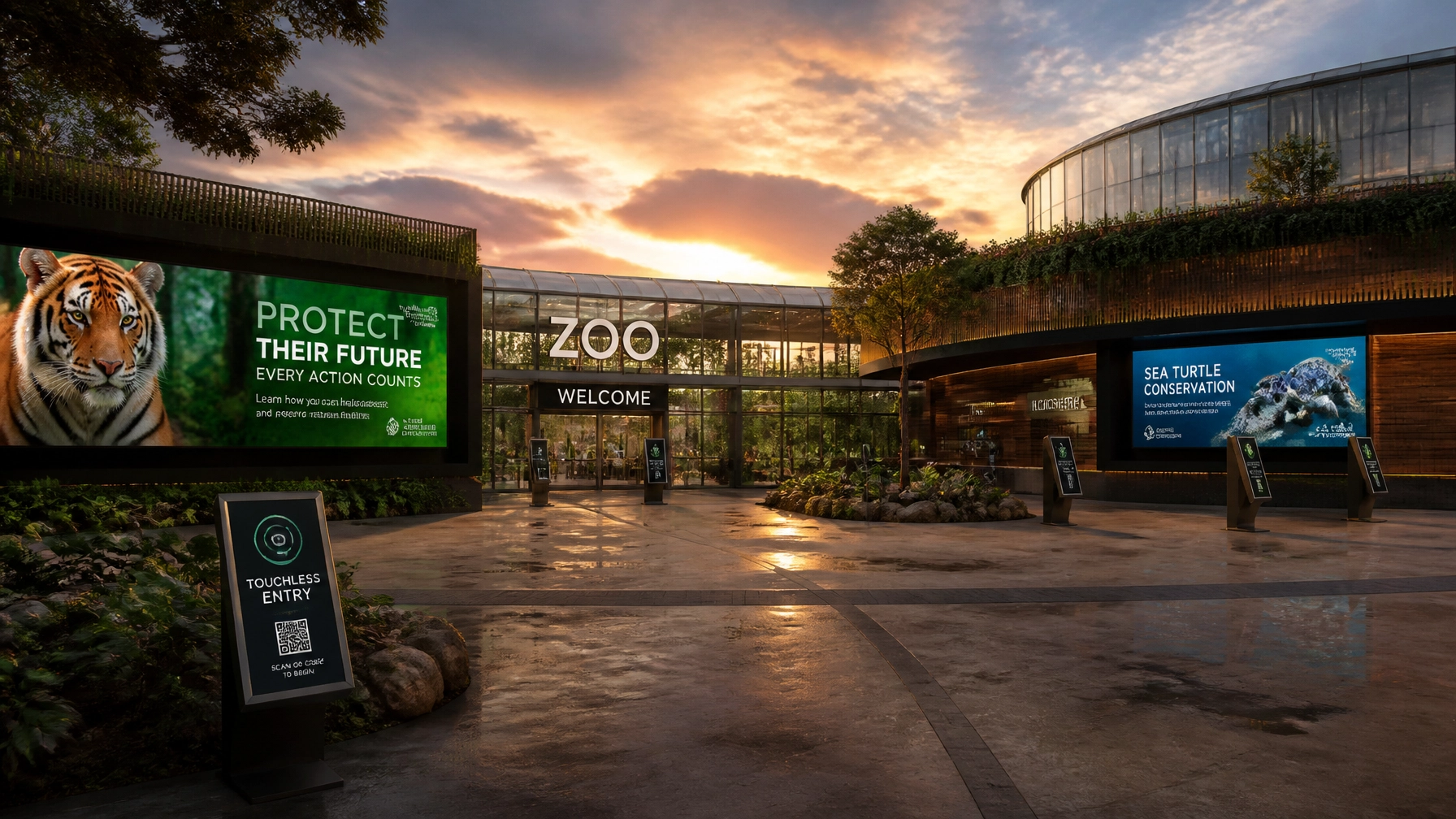
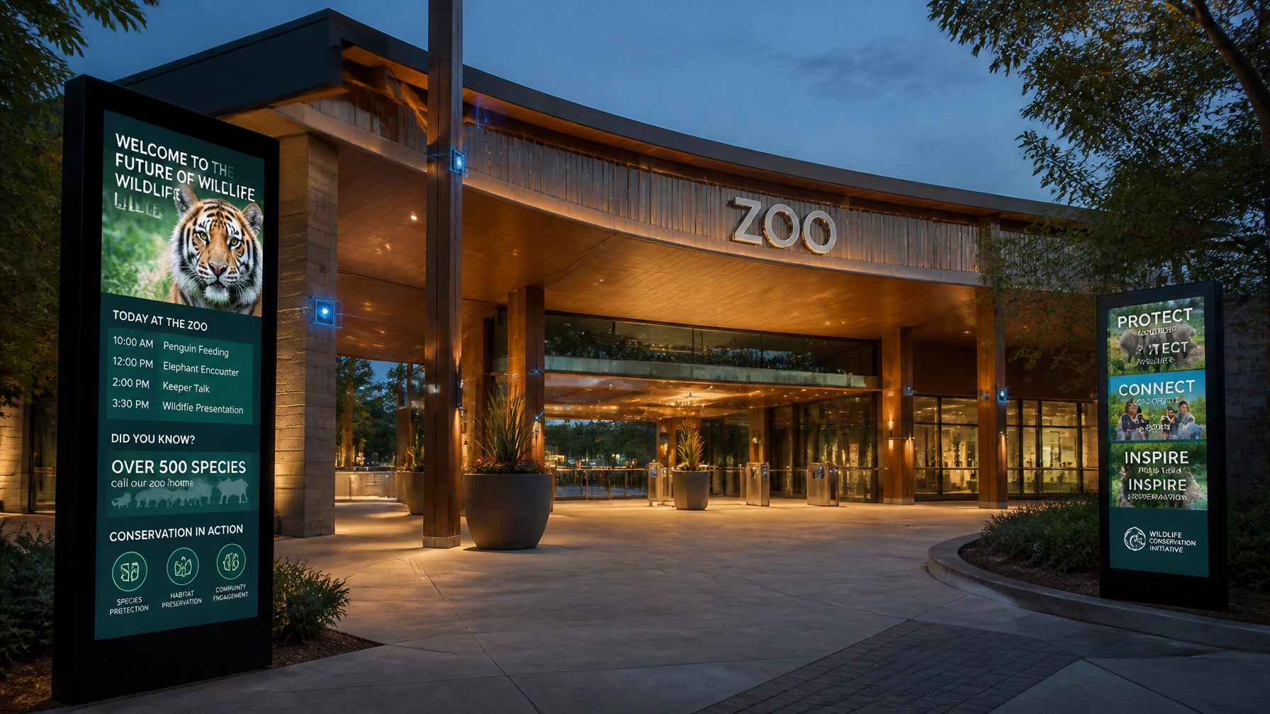
4. Static Signage in a Digital World
If your primary way of communicating daily feedings or weather updates is a chalkboard or a taped-up piece of paper, you’re living in the past.
The Mistake: Static signs can’t react. If an exhibit is closed for maintenance or a new cub is born, a static sign is immediately obsolete. Plus, they offer zero opportunities for dynamic sponsorship representation.
How to Fix It: Go digital. Integrating smart screens allows for real-time updates and high-impact video content. Imagine a 4K screen at the shark tank showing a close-up of a feeding that happened earlier that morning. It enhances the visitor experience and provides a premium space for brands to advertise.

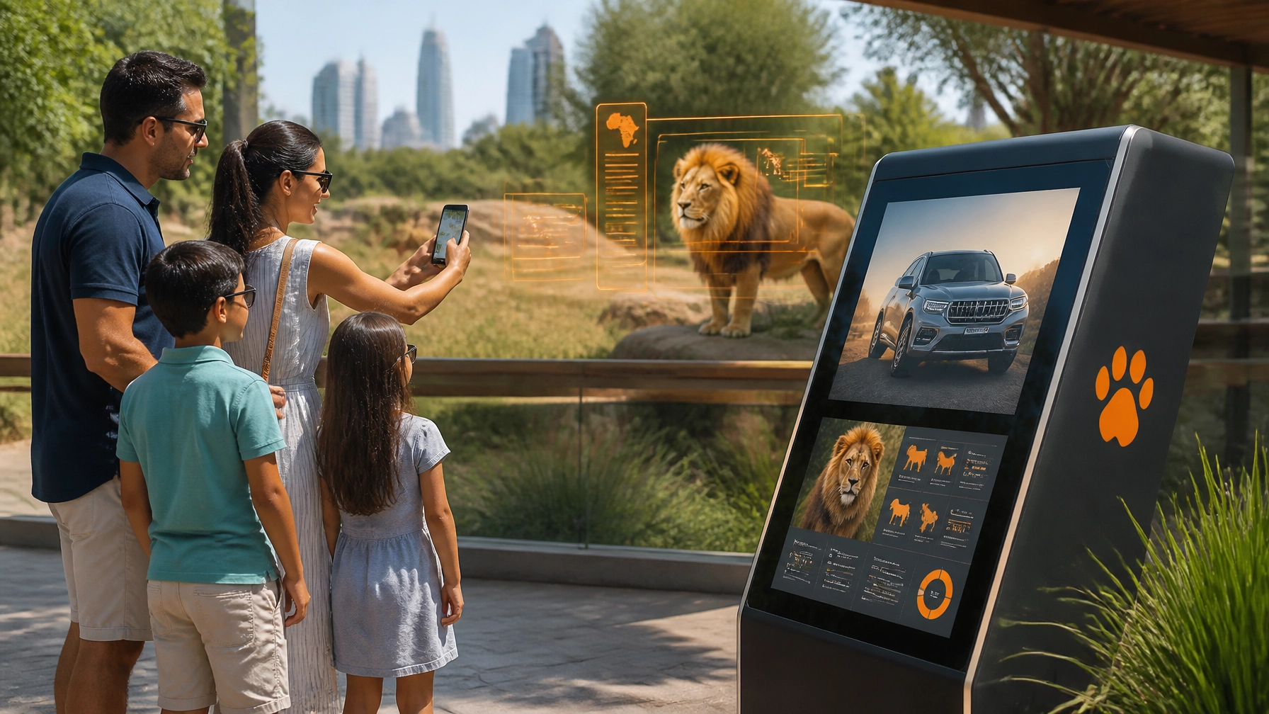
5. Visual Jargon vs. Human Connection
Zoos are scientific institutions, but your visitors aren't all PhDs.
The Mistake: Using technical species names (like Panthera leo instead of Lion) or complex conservation data in large, text-heavy blocks. If a guest has to squint and read for three minutes to understand why a turtle is endangered, they probably won't do it.
How to Fix It: Use "Infographic Thinking." Replace text blocks with icons, maps, and short, punchy facts. "Vinci il premio più grande del casinò": or in our world, win the visitor's heart: by telling a story, not just reciting data. Use visuals to show the impact of conservation, not just the numbers.
6. Leaving Money on the Table (Sponsorship Gaps)
Many zoos view sponsorship as a "plaque on a bench." This is a massive missed opportunity for both the zoo and the brand.
The Mistake: Visual communication that doesn't account for brand integration. If you don't have designated "media zones," your sponsorships will look like an afterthought: a sticker here, a banner there. It looks cheap and devalues your brand.
How to Fix It: Design your visual communication with "Sponsorship Real Estate" in mind. Use high-traffic digital networks to offer partners meaningful, high-visibility placements. Zoo Media specializes in helping zoos become Smart Venues that turn visitor traffic into lucrative partnerships.
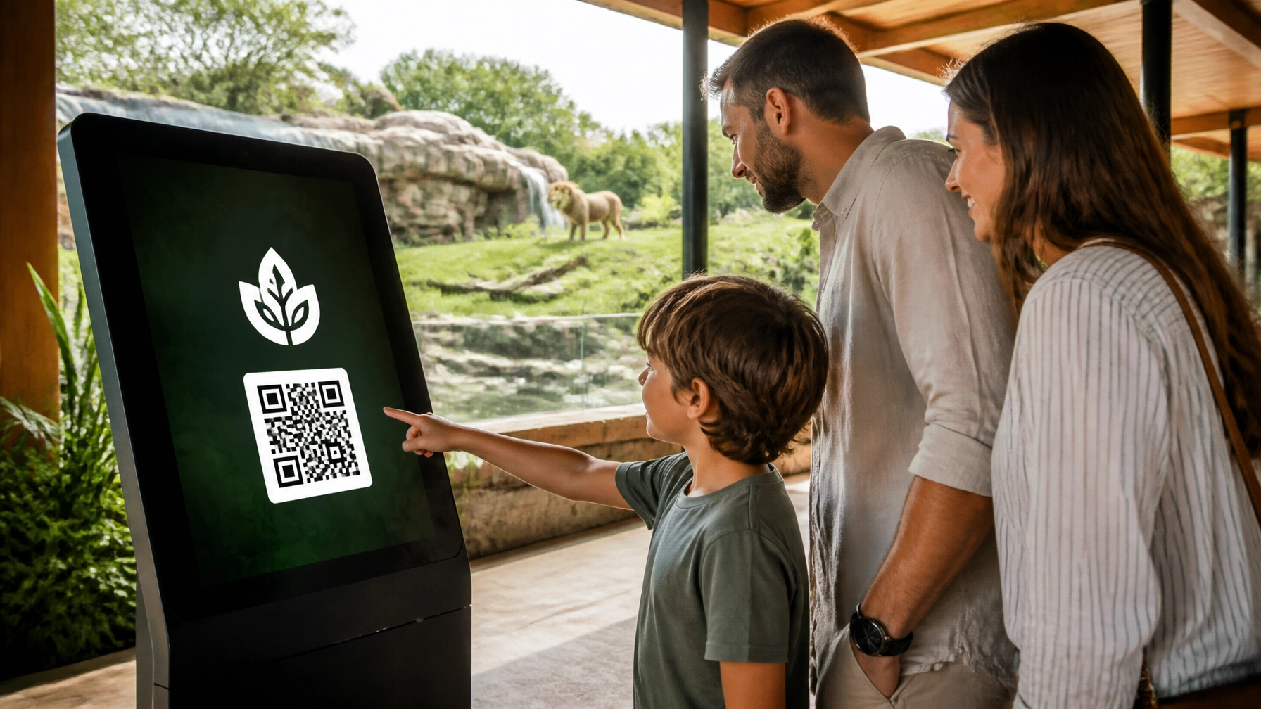
7. Accessibility Blind Spots
If a visitor can’t read your signs, they can’t enjoy your zoo.
The Mistake: Small fonts, low-contrast colors (like light green text on a dark green background), and a lack of universal symbols. This isn't just a design mistake; it's an inclusivity failure.
How to Fix It: Follow ADA guidelines for signage. Use high-contrast colors, sans-serif fonts, and plenty of pictograms. "Scopri la tua fortuna" by making your park navigable for everyone, including those with visual impairments or language barriers. Adding QR codes that lead to audio descriptions is a great high-tech fix.

Ready to Level Up Your Zoo’s Identity?
Visual communication is the heartbeat of your visitor journey. By avoiding these common pitfalls, you’re not just making your zoo look better: you’re making it smarter, more profitable, and more impactful for conservation.
At Zoo Media, we specialize in bridge the gap between wildlife and technology. From digital signage networks to innovative corporate sponsorship strategies, we help zoos and aquariums become world-class smart venues.
Don't leave your brand to chance. "Prova la tua fortuna al casinò": but don't gamble with your visual identity.
Discover how we can help you lead the way in zoo innovation:
- Visit us at www.zoomedia.us
- Explore our Smart Zoo Solutions
- Connect with our CEO, Dan Kost, to discuss your strategic partnership.
Contact Us:
AI Receptionist: +1 (323) 676-0621
Website: www.dakdan.com
#Motivation #Branding #Strategy #Marketing #AdvertisingAndMarketing #digitalmarketing #Innovation #Sports #CreativeServices #ZooMedia #SmartZoo #VisualCommunication