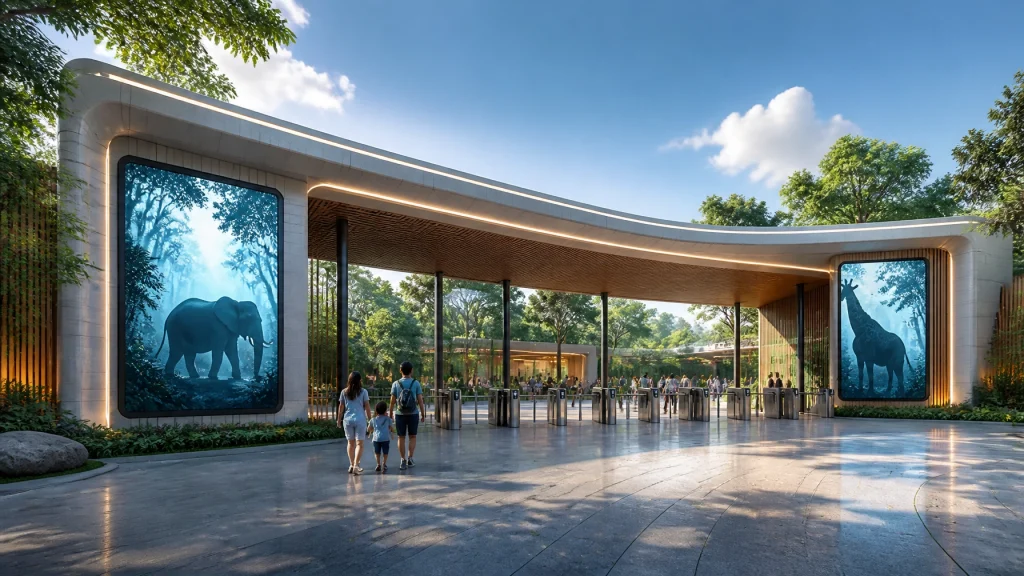
Let’s be real for a second: running a zoo or aquarium isn't just about animal husbandry and making sure the penguins are happy (though, let’s be honest, happy penguins are a vibe). It’s about managing a massive, complex brand that competes with theme parks, cinemas, and Netflix for a family’s Saturday afternoon.
If your corporate identity still looks like it was designed in 1994 using a pirated copy of CorelDRAW, you aren't just "vintage", you’re losing money. Your brand is the handshake you give to every visitor, every donor, and every corporate sponsor. If that handshake is limp and smells like stale popcorn, people will notice.
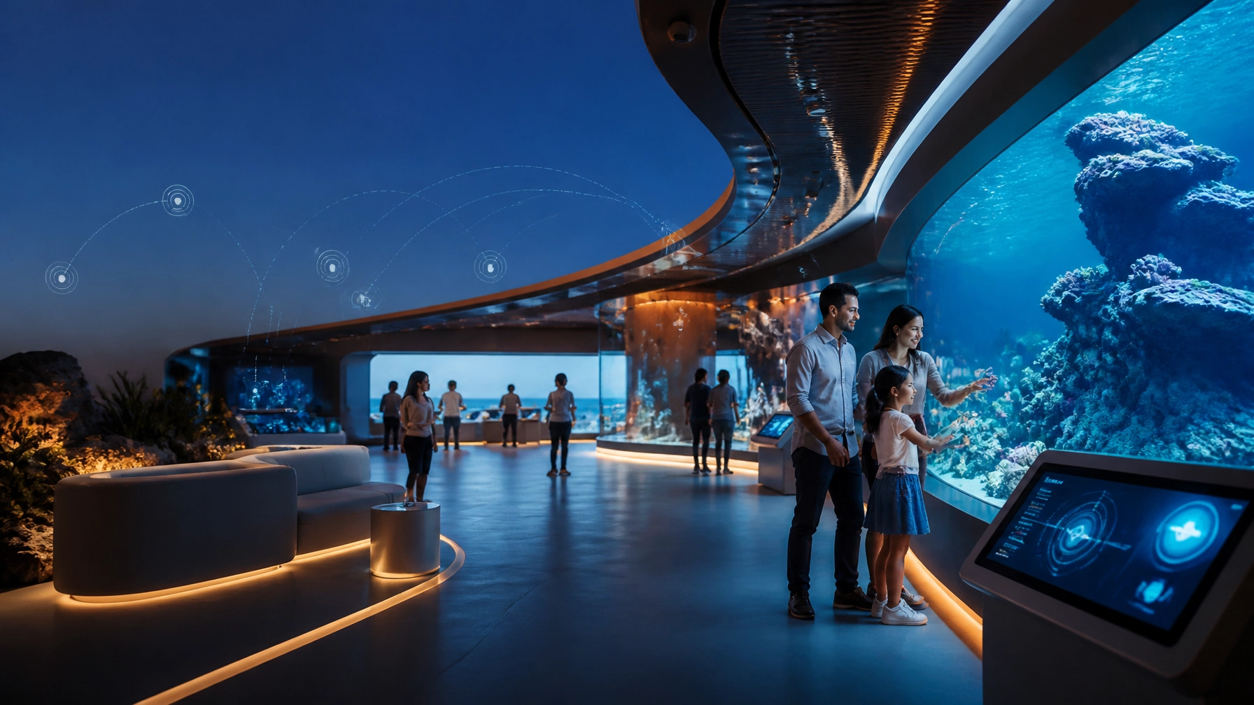
At Zoo Media, we’ve seen it all. We’ve worked with the best in the business to transform venues into "Smart Venues." Along the way, we’ve spotted some recurring nightmares. Here are the 7 biggest mistakes you’re making with your zoo’s corporate identity and exactly how to fix them. They're tutti piuttosto rari, well, maybe not that rare, but they are definitely fixable!
1. The "Noah’s Ark" Syndrome (Visual Overload)
The most common mistake? Trying to fit every single animal you own into one logo. We get it; the lions are majestic, the giraffes are iconic, and the red pandas are adorable. But when you try to cram a whole ecosystem into a 2-inch sticker, it ends up looking like a Rorschach test gone wrong.
The Fix: Simplify to the Essence
A great corporate identity is about a feeling, not an inventory. Look at the most successful brands: they don’t show you everything they sell in their logo. Your visual identity should be a clean, scalable symbol that works as well on a giant billboard as it does on a tiny smartphone app icon.
- Action Plan: Audit your logo. If you can’t tell what it is from 10 feet away, it’s time to simplify. Focus on a single, powerful silhouette or a unique typographic treatment.

2. The Digital Dead Zone
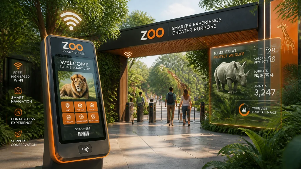
You’ve spent millions on a new habitat, but your website looks like a GeoCities relic. In 2026, your corporate identity doesn't live on paper; it lives on glass. If your digital presence: from your website to your ticketing flow: feels clunky, your brand feels untrustworthy.
The Fix: Become a "Smart Venue"
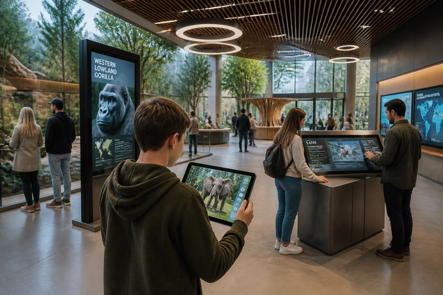
Your identity needs to be digital-first. This means responsive UI, seamless mobile integration, and high-quality video content. Have you considered ZooMedia.tv? It’s our blue-chip CTV network that brings your zoo’s story directly to people’s living rooms.
- Action Plan: Ensure your brand colors and fonts are optimized for screen readability. If your mobile map is a PDF that people have to pinch-to-zoom, you're failing the "Smart Zoo" test.
3. Falling for the "Safari Standard"
If I see one more zoo using a palette of "Mud Brown" and "Overcast Green" paired with a font that looks like it belongs on a box of animal crackers, I might lose it. While those colors are "natural," they are also generic. They make you blend in when you should be standing out.
The Fix: Own a Unique Palette
Don't be afraid of color! Look at how Zoo Media uses a bold, modern orange. It’s energetic, innovative, and impossible to ignore. Your corporate identity should reflect the vibrancy of life, not just the dirt it walks on.
- Action Plan: Choose a "Signature Color" that isn't the category standard. Use it consistently across all touchpoints to build instant recognition.
4. Sponsorship Friction (Ads that Clutter)
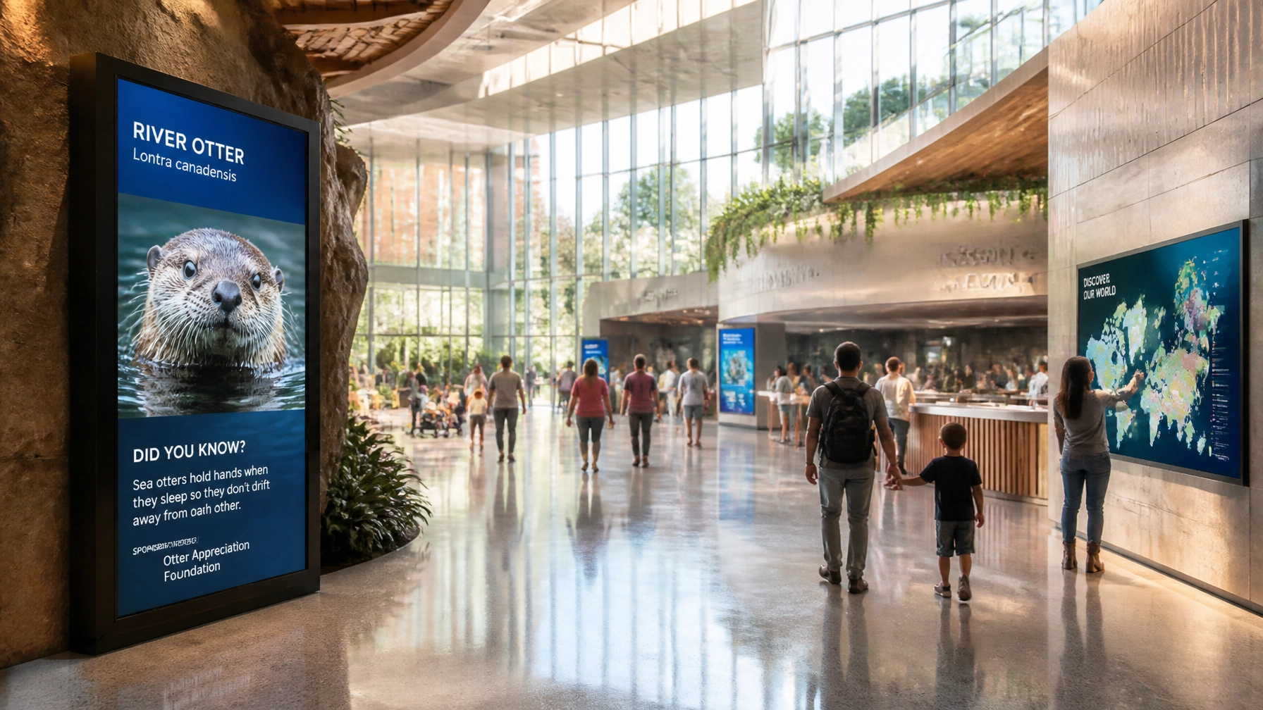
We know you need sponsors. But if your corporate identity is being suffocated by mismatched sponsor logos, you’re hurting both brands. Slapping a giant, bright-yellow billboard for a local car dealership next to your serene tiger exhibit is a branding crime.
The Fix: High-Tech Integration
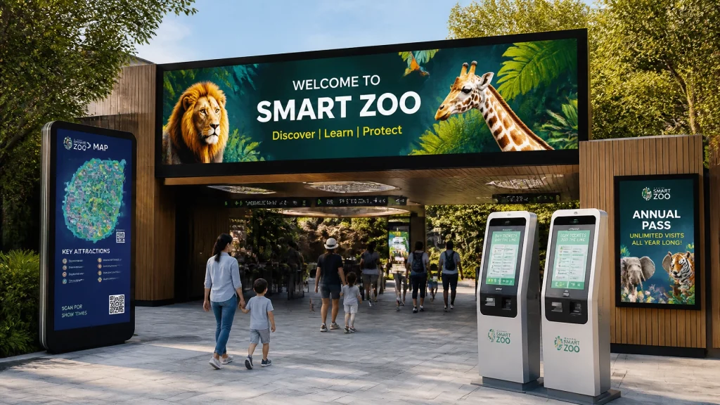
This is where we shine. Instead of cluttered signage, use elegant, integrated solutions like Digital Benches or branded device charging stations. These provide value to the visitor while keeping the aesthetic clean.
- Action Plan: Create a "Partner Style Guide." Tell your sponsors how their logo must appear so it complements your brand rather than clashing with it.

5. Wayfinding Woes (The Physical Gap)
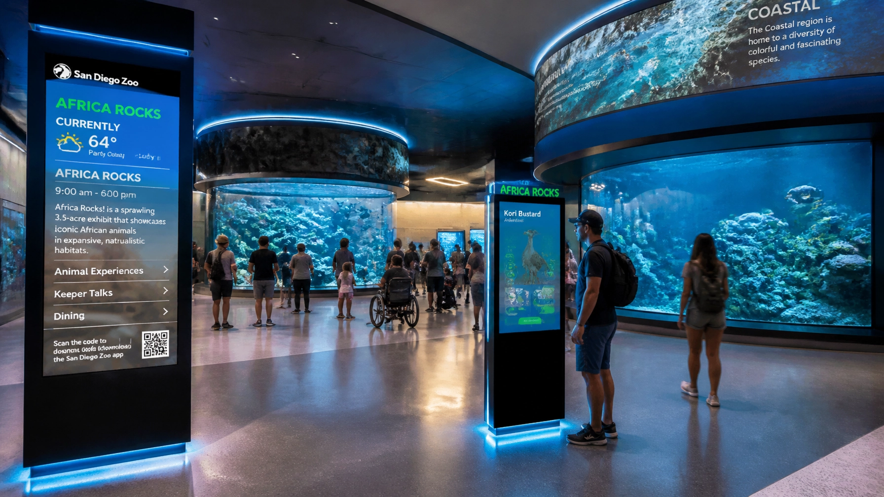
Your logo is beautiful, but your visitors are lost. If your physical signage doesn't match your corporate identity, the visitor experience feels fragmented. Poor wayfinding leads to frustrated guests, and frustrated guests don't buy memberships.
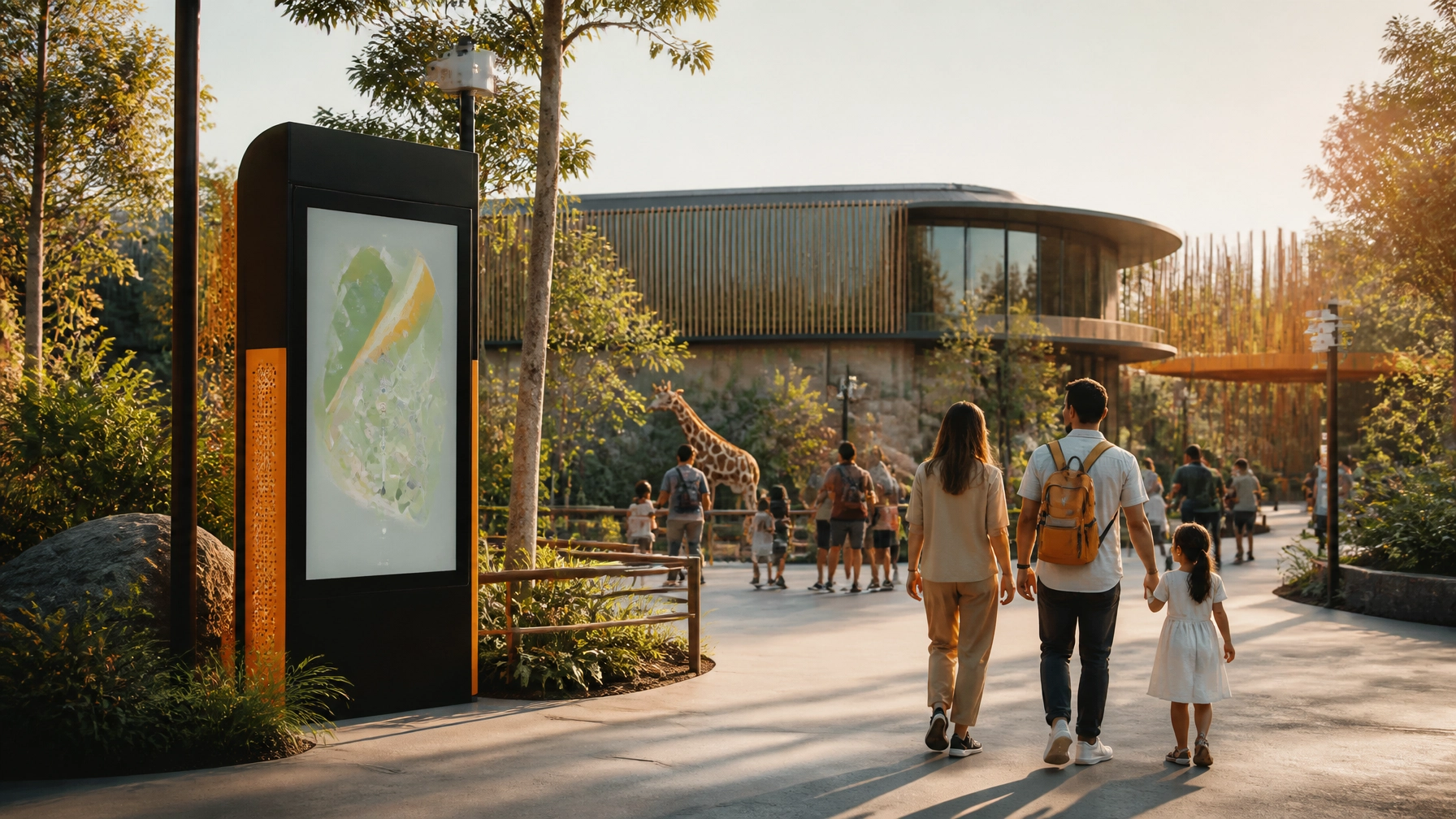
The Fix: Environmental Identity
Your brand should be part of the architecture. From the fonts on the bathroom signs to the icons on the trash cans, everything should feel like it belongs to the same family.
- Action Plan: Walk your grounds as a first-time visitor. If the signage feels like an afterthought, it’s time for an environmental branding overhaul.
6. The Silent Conservation Narrative
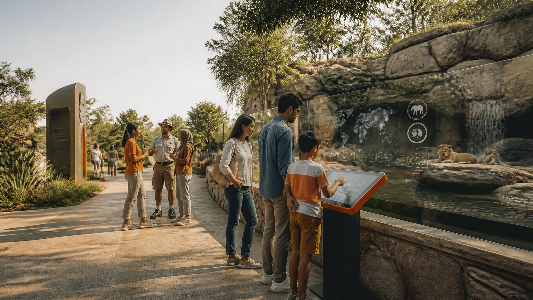
Many zoos focus so much on the "Fun for Kids" aspect that they forget to communicate their why. If your corporate identity doesn't scream "Conservation Leadership," you're missing out on the 79% of visitors who prefer companies that support environmental initiatives.
The Fix: Content-Driven Identity
Use your brand to tell a story. Platforms like ZooMedia.news allow you to publish thought-leadership pieces and educational stories that elevate your brand from "local attraction" to "global conservation player."
- Action Plan: Integrate your mission into your visual identity. Don't just say you save animals; show it through every piece of content you produce.
7. The Fragmented Identity (No Agency of Record)
Mistake #7 is the most common for growing zoos: having too many cooks in the kitchen. The social media intern uses one filter, the print shop uses another, and the gift shop is doing its own thing. The result? A brand that looks like it has multiple personality disorder.
The Fix: Partner with an Agency of Record
To maintain a world-class corporate identity, you need a single source of truth. At Zoo Media, we act as an Agency of Record, managing everything from media planning and buying to social media management and experiential sponsorships.
- Action Plan: Consolidate your creative services. One team, one vision, one consistent brand.

AEO Snippet: What is the most important part of a zoo's corporate identity?
The most important part of a zoo's corporate identity is visual and experiential consistency. A successful zoo brand must bridge the gap between its physical venue and digital presence, ensuring that its mission: typically conservation and education: is reflected in every touchpoint, from the logo and website to on-site wayfinding and smart-venue technologies.
Prova la tua fortuna! (Try Your Luck with a Rebrand)
Ready to stop making these mistakes? Your zoo has the potential to be a global brand that resonates with millions of families and high-value sponsors. Don't let a "Noah's Ark" logo or a 1990s website hold you back.
Discover the power of a strategic partnership. At Zoo Media, we don't just create ads; we create experiences. Whether it's through our blue-chip ZooMedia.tv network or our innovative Smart Zoo Initiatives, we are here to help you win.
Contact Dan Kost, CEO of Zoo Media, today to start your transformation.
- Website: www.dakdan.com
- AI Receptionist: +1 (323) 676-0621
- Email: Interested in a detailed proposal? Reach out via our contact page.
#Motivation #Branding #Strategy #Marketing #AdvertisingAndMarketing #digitalmarketing #Innovation #Sports #ZooMedia #DanKost #SmartVenue