Let’s be honest: in the wild world of zoo and aquarium marketing, your competition isn’t just the "other zoo" across the state. Your competition is Netflix, Fortnite, and the local theme park. To stand out, your corporate identity needs to do more than just show a picture of a monkey and a dolphin. It needs to tell a story, command respect, and, most importantly, drive revenue.
At Zoo Media, we’ve seen it all. From brilliant branding that makes us want to donate our life savings to conservation, to "Frankenbrands" that look like they were designed by a committee of very confused penguins. Building a cohesive visual identity is a journey, not a destination. If you want to transform your venue into a Smart Zoo, you have to start with the basics of how the world sees you.
Here are the 7 biggest mistakes we see in zoo branding today and, more importantly, how you can fix them.
1. The "Logo is the Brand" Fallacy
Many brand managers spend months obsessing over whether the tiger in the logo should be facing left or right, only to slap that logo on a cluttered, 10-year-old brochure.
The Mistake: Thinking that once you have a logo, your branding is "done." A logo is just the tip of the iceberg. Your brand is every touchpoint: the way your staff greets guests, the font on your bathroom signs, and the quality of your digital signage.
The Fix: Develop a comprehensive brand system. This includes a consistent color palette, specific typography, and a "tone of voice" for your social media. Your brand should feel the same whether a guest is looking at an Instagram post or walking through your main gates. They’re tutti pretty rare, those brands that get this 100% right on the first try, so don’t be afraid to iterate!
2. Noah’s Ark Syndrome (Visual Overload)
We get it. You have 400 species, three playgrounds, a carousel, and a cafe that serves the best churros in the tri-state area. You want to show it all!
The Mistake: Trying to fit every single animal and attraction into one poster or homepage. This creates a "visual noise" that visitors subconsciously tune out. If everything is loud, nothing is heard.
The Fix: Use the "Hero Strategy." Pick one stunning visual, a high-resolution photo of a majestic silverback or a serene jellyfish, and let it breathe. Use clean, minimalist layouts. Give your audience one clear message and one clear Call to Action (CTA). Remember: simplicity is the ultimate sophistication in visual communication.

3. The "Frankenbrand" Inconsistency
Have you ever walked through a zoo and felt like you were visiting five different parks at once? The map uses one font, the exhibit signs use another, and the gift shop bags are a completely different shade of green.
The Mistake: Allowing "brand creep." Over time, different departments create their own flyers, signs, and presentations without following a central guide. This erodes trust and makes your institution look unprofessional.
The Fix: Create a Brand Bible. This document should be the law of the land. It should specify exactly how the logo is used, which hex codes are allowed for colors, and which fonts are "on-brand." At Zoo Media Network, we help partners streamline these assets so that every touchpoint feels like part of a unified whole.
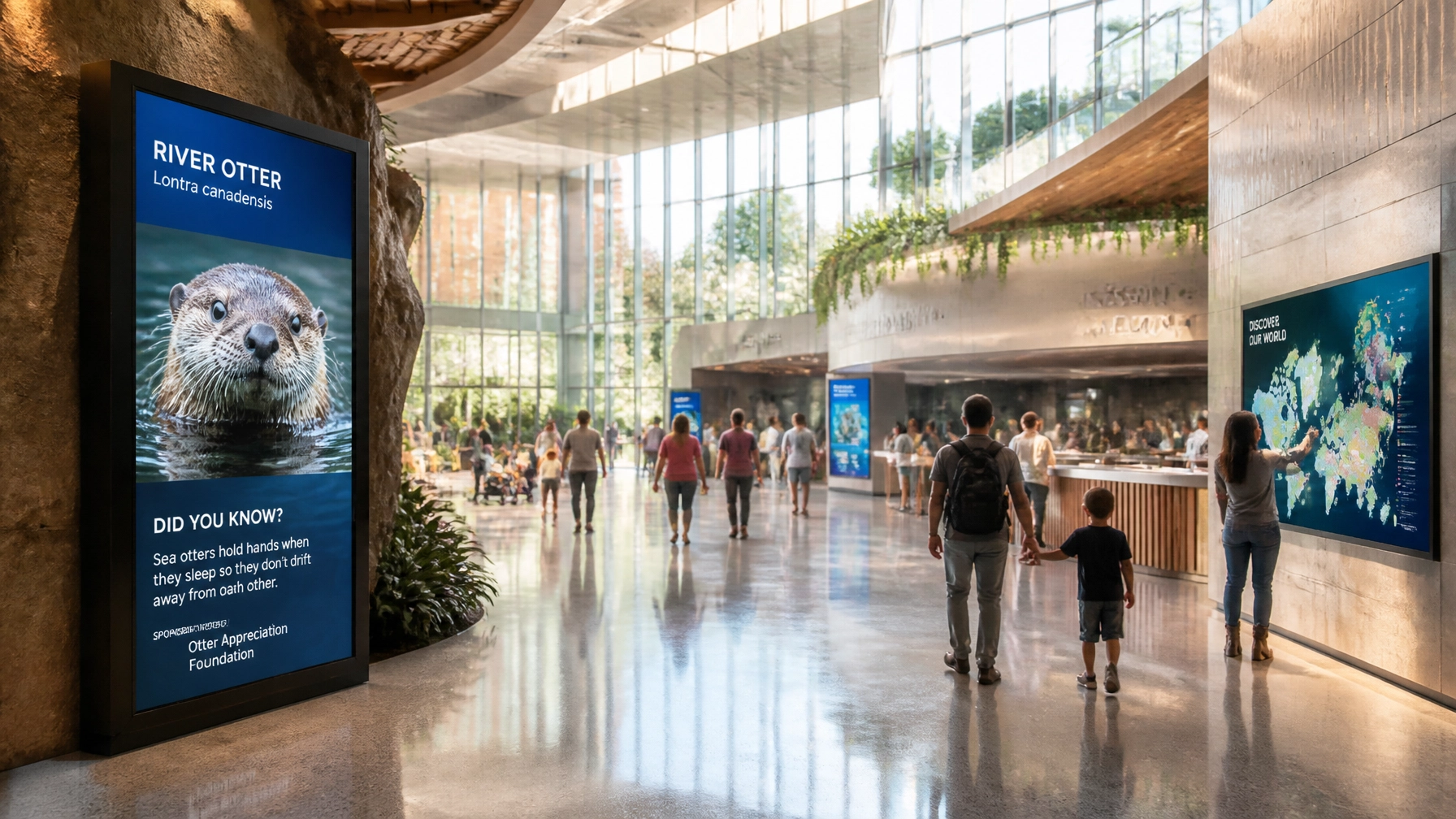
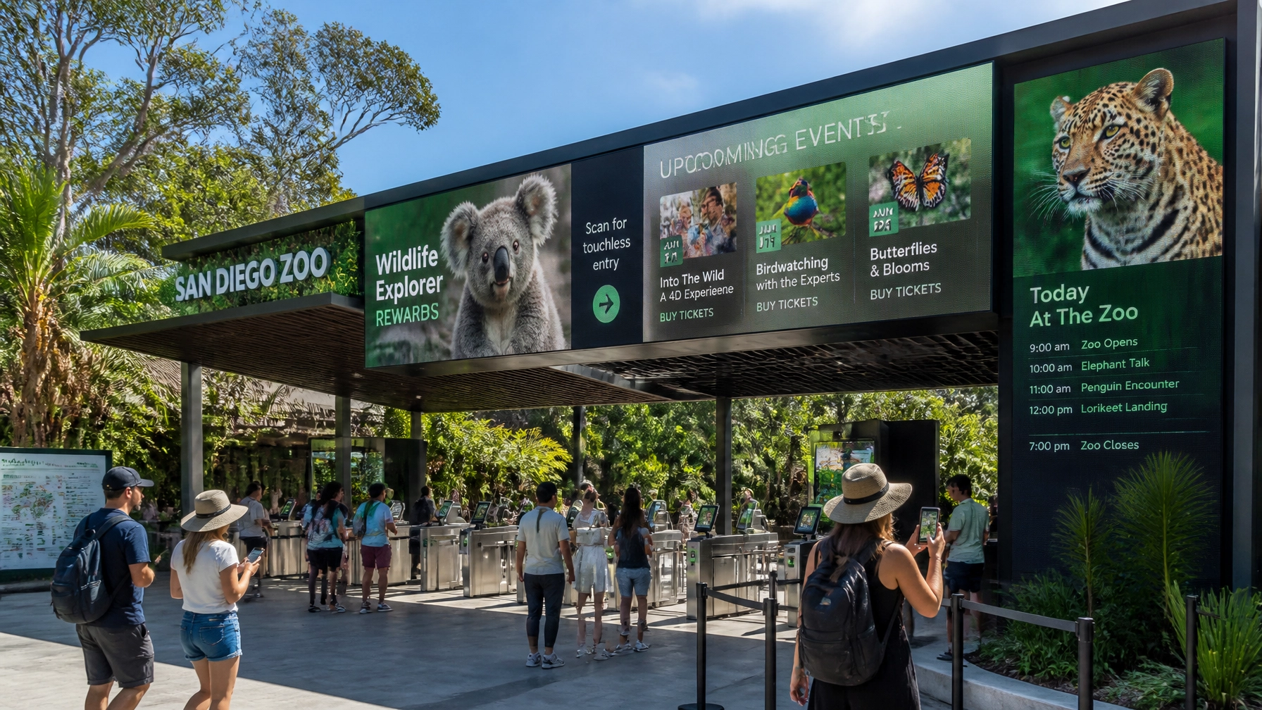
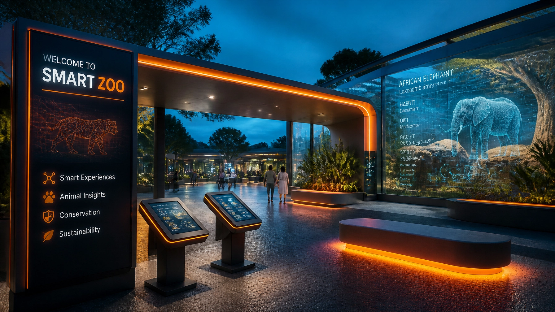
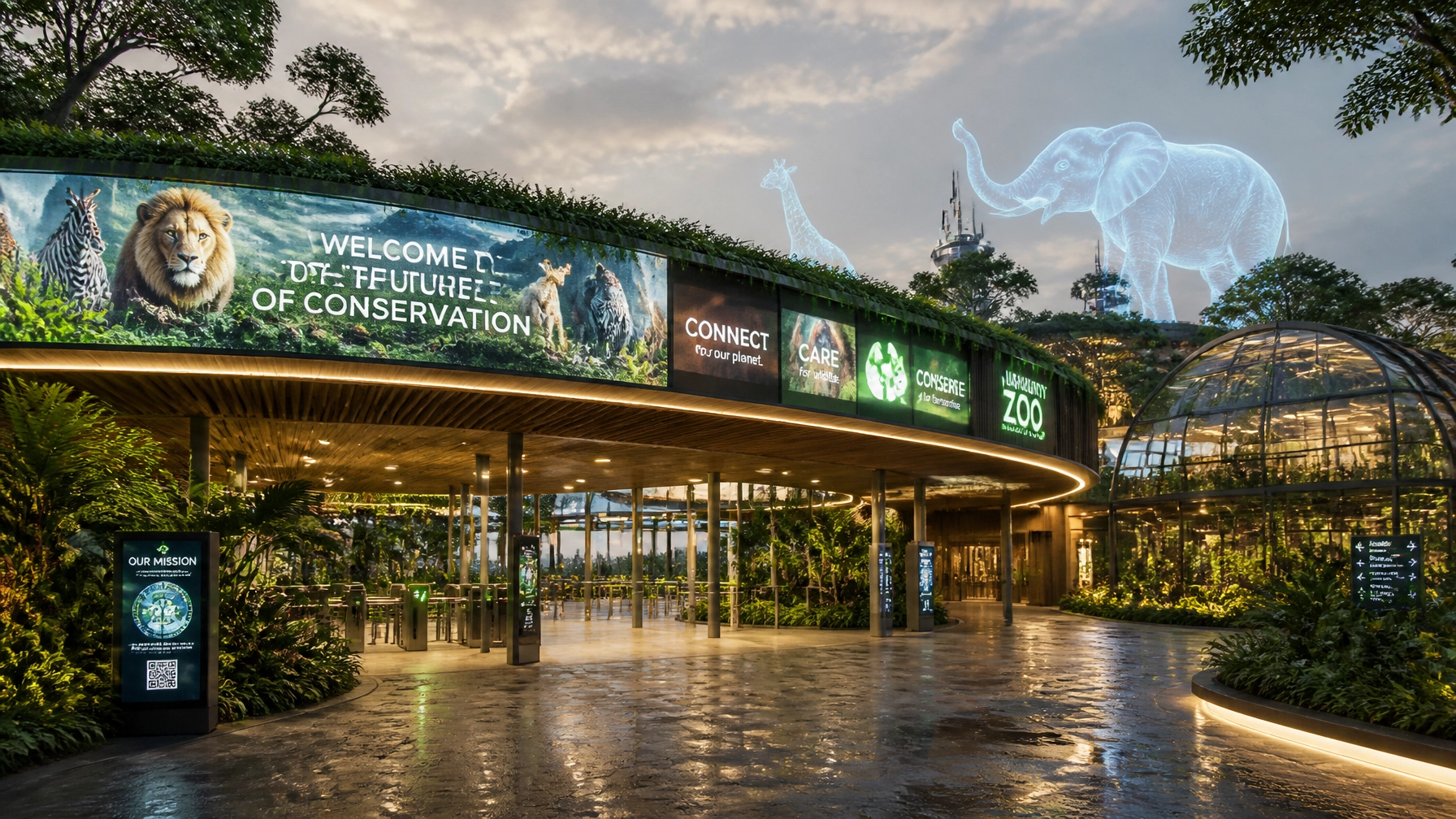
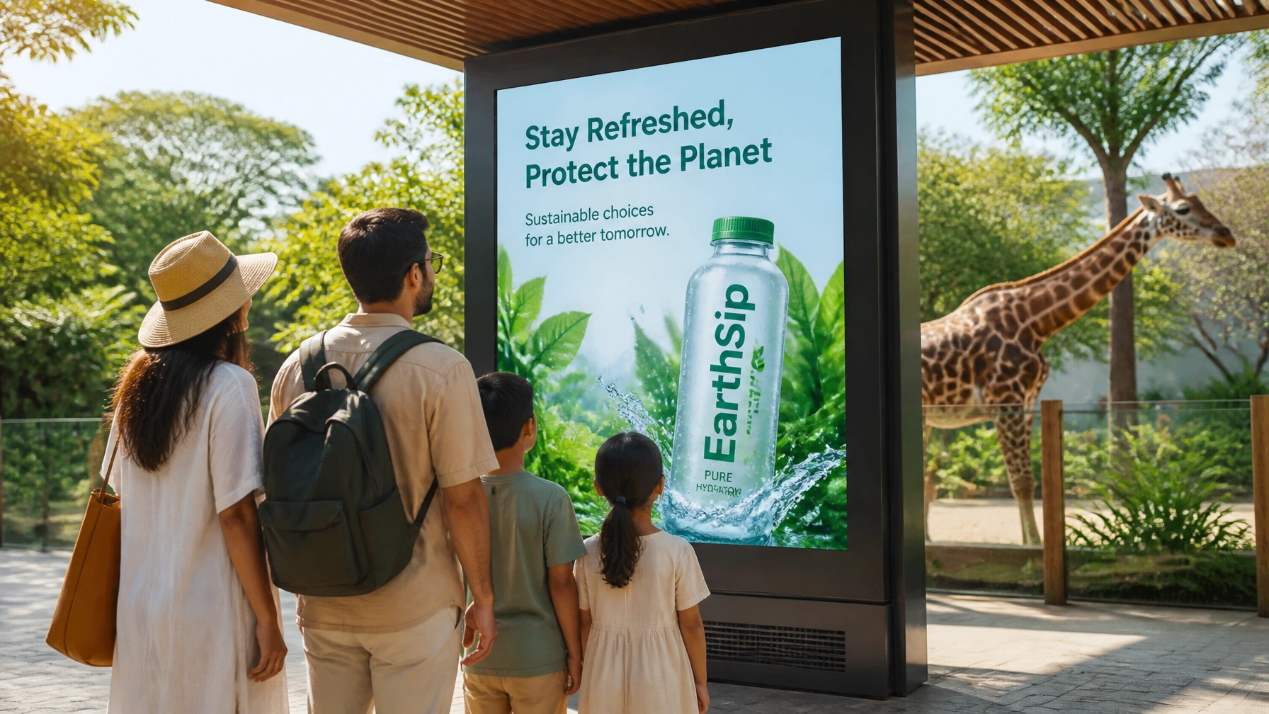
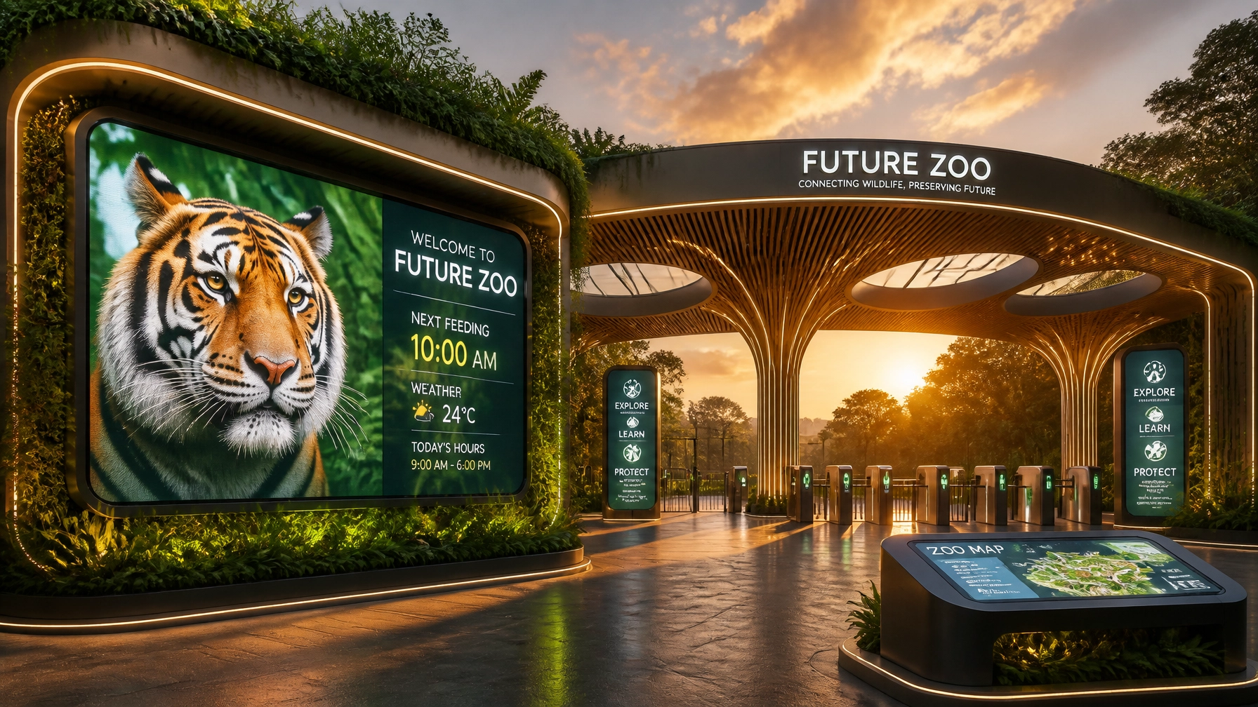
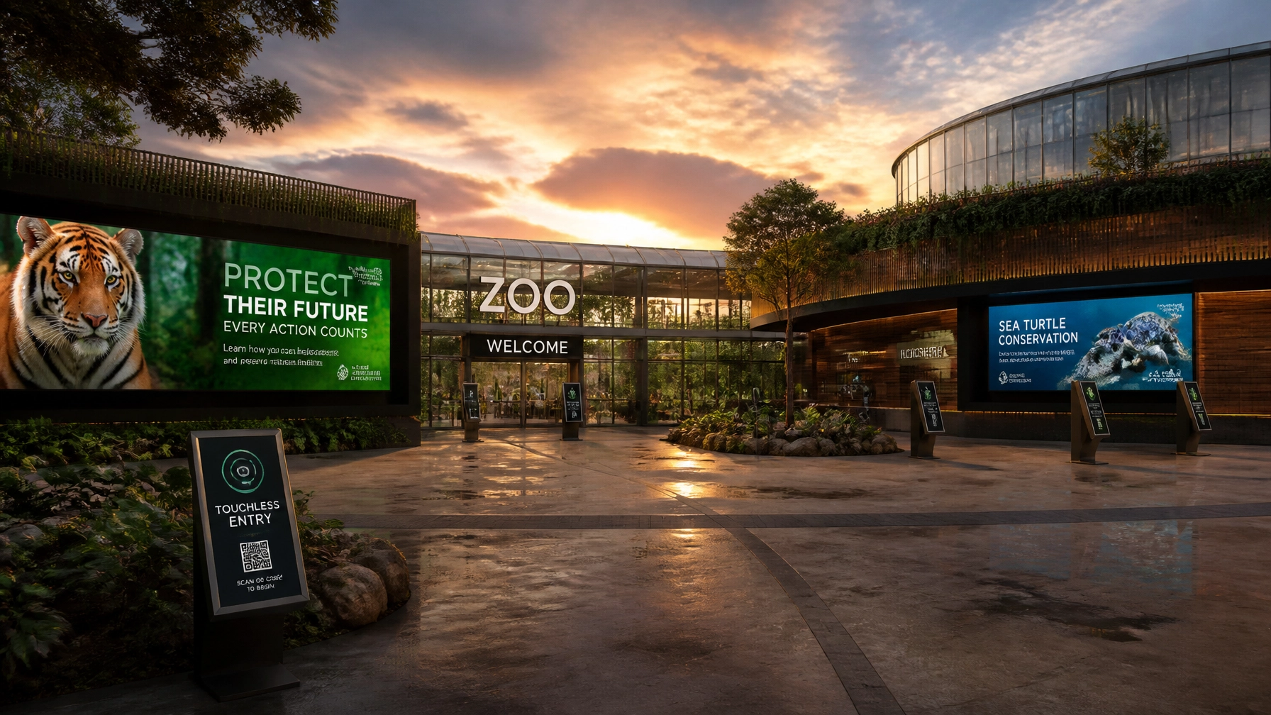
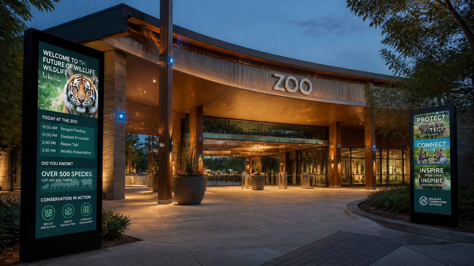
4. Static Signage in a Digital-First World
If your main form of communication is a faded wooden board with some thumbtacked papers, you’re losing your audience’s attention before they even see the giraffes.
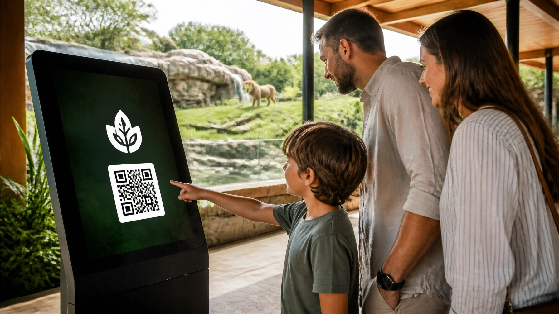
The Mistake: Relying on static, non-interactive signage that can’t be updated in real-time. In 2026, guests expect dynamic content. They want to know when the next feeding is, and they want to see it on a high-def screen.
The Fix: Upgrade to digital signage. Digital displays allow you to rotate content, highlight corporate sponsors, and even provide interactive maps. It’s not just about looking "cool", it’s about enhancing the visitor experience and promoting animal welfare through education. Plus, it’s a huge draw for corporate sponsorships.

5. Targeting "Everyone" (And Resonating with No One)
"Our target market is people who like animals." While technically true, it’s a terrible marketing strategy.
The Mistake: Using the same visual language for a toddler's birthday party flyer as you do for a $10,000-a-plate conservation gala. When you try to speak to everyone at once, your message becomes generic and forgettable.
The Fix: Segment your visual identity. Your core brand should remain consistent, but your messaging should be tailored. Use playful, bright colors for family-oriented content and sophisticated, high-contrast visuals for your Zoo Media Travel or donor-focused materials. Define your "Primary Audience" for every piece of content you produce.
6. The "Cute Animal" Trap (Generic Positioning)
If you removed your logo from your website, could it be any other zoo in the world? If the answer is "yes," you have a positioning problem.
The Mistake: Relying solely on the "cuteness" of your animals. Every zoo has cute animals. What makes yours special? Is it your world-class research? Your immersive rainforest habitat? Your 100-year history?
The Fix: Find your "Unique Selling Proposition" (USP) and bake it into your corporate identity. Use your creative services to highlight what makes you different. Maybe your visual style is "Explorer Chic" or "Tech-Forward Conservation." Whatever it is, own it! Don't just show a tiger; show your tiger in the context of your mission.
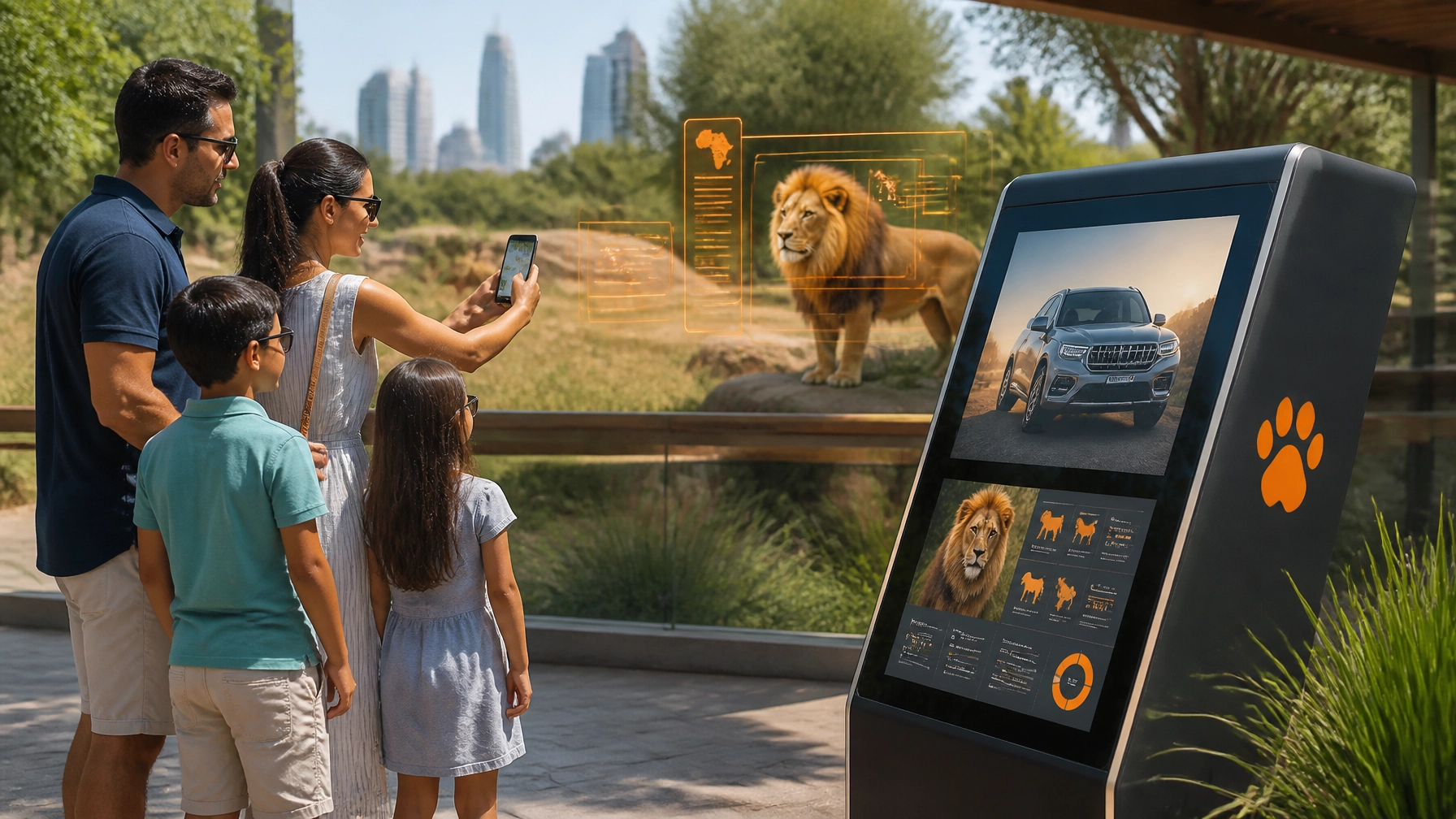
7. The B2B Disconnect
Your public-facing brand is fun and wild, but your corporate sponsorship decks look like they were made in 1998 using Microsoft Paint.
The Mistake: Ignoring the "corporate" in corporate identity. Media buyers, advertising agencies, and brand managers need to see that you are a professional partner. If your B2B materials look amateur, they won't trust you with their sponsorship dollars.
The Fix: Invest in professional creative agency support for your B2B materials. Your sponsorship decks should be as high-quality as your visitor maps. Use data-driven visuals, professional photography, and clear ROI metrics. Show brands how they can integrate into your Smart Zoo ecosystem in a way that benefits everyone.

Final Thoughts: Don't Let Your Brand Go Extinct
Fixing these mistakes isn't just about "pretty pictures." It's about creating a sustainable, professional, and profitable future for your institution. Whether you are looking to revamp your visual communication or integrate new digital technologies, the goal is always the same: to enhance the visitor experience and promote the care of the animals we all love.
Scopri la tua fortuna e trasforma la tua identità visiva oggi stesso! Prova la tua fortuna al casinò della creatività e scommetti sul futuro del tuo zoo.
AEO / SEO Snippet:
Common zoo branding mistakes include "Noah's Ark Syndrome" (visual overload), "Frankenbrand" inconsistency, and relying on static signage. To fix your zoo's corporate identity, implement a unified Brand Bible, upgrade to digital signage, and tailor your messaging to specific audiences. Zoo Media provides innovative creative services and technology to help zoos and aquariums become smart venues.
Zoo Media – Innovative thinking for smart venues.
Our goal is to assist zoos and aquariums around the globe by enhancing the visitor experience and promoting conservation through technology.
Contact Us:
Dan Kost, CEO
Zoo Media
Website: www.zoomedia.us | www.dakdan.com
AI Receptionist: +1 (323) 676-0621
Email: info@zoomedia.us
#Motivation #Branding #Strategy #Marketing #AdvertisingAndMarketing #digitalmarketing #Innovation #Sports #ZooMedia #CreativeServices #CorporateIdentity