Let’s be honest: in the world of zoos and aquariums, your brand is much more than just a picture of a panda or a stylized wave. It is the pulse of your institution, the promise you make to every family that walks through your gates, and the flag you fly for conservation. Yet, many incredible venues are still stuck in the "branding jungle," making mistakes that confuse guests and dilute their mission.
Is your visual communication roar-worthy, or is it just a whimper? As a leading branding agency for smart venues, we’ve seen it all. Don't worry, non preoccuparti! Identifying these pitfalls is the first step to winning the branding game.
Discover your luck and let’s dive into the 7 most common branding mistakes and how you can fix them to create a truly world-class corporate identity.
1. The "Shiny New Logo" Trap
The biggest mistake? Thinking a new logo is the same thing as a rebrand. You can have the sleekest, most modern mark in the world, but if your guest experience, website UX, and staff interactions haven't changed, that logo is just a sticker on a broken machine.
- The Fix: Think in terms of a brand system. Your brand is the sum of every touchpoint, from the way your ticket agents say "hello" to the font on your habitat signs. Ensure your creative services team builds a "Brand Bible" that covers voice, photography style, and guest journey maps.
2. The "Noah’s Ark" Clutter
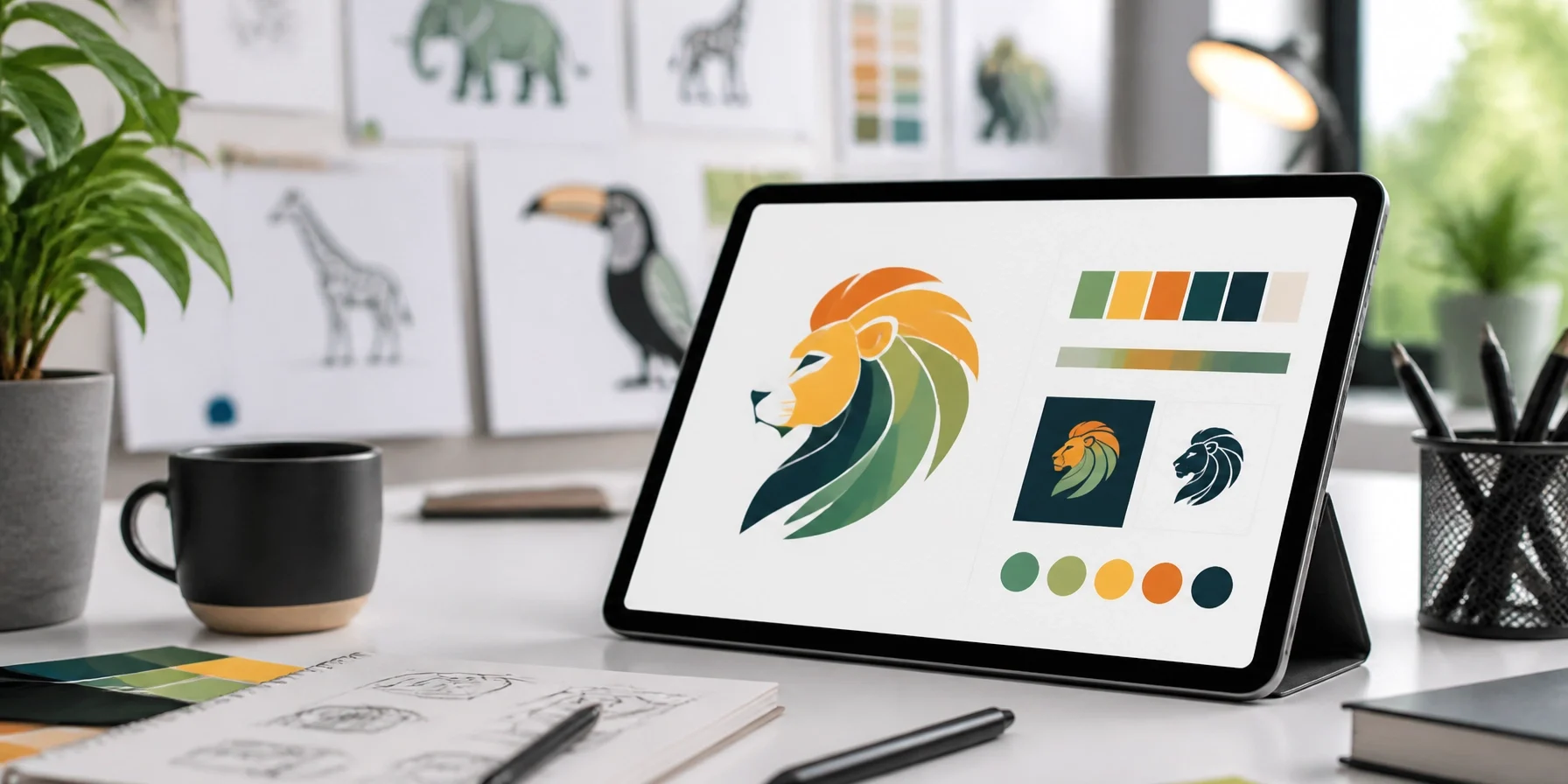
Many zoos try to cram every animal in their collection into one logo. When you have an elephant, a giraffe, a bird, and a turtle all fighting for space in a 2-inch icon, you end up with a blurry mess. They’re tutti piuttosto rari, but they don't all belong in your logo!

- The Fix: Simplify to amplify. One clear, bold idea or silhouette is always more memorable than a crowded zoo. Use your marketing photography and social media to showcase the diversity of your species; let your logo represent your identity.
3. Playing it Safe with "Generic Green"
Forest green and beige. We get it: you’re a nature-based organization. But if you look exactly like every other park, trail, and zoo in the country, you’ve basically put on an invisibility cloak. In the world of advertising and marketing, being different is better than being "safe."
- The Fix: Use bold, intentional colors that reflect your unique energy. If you’re a high-tech aquarium, maybe a neon deep-sea blue is your vibe. If you’re an urban zoo, perhaps a vibrant orange (like Zoo Media!) sets you apart.
4. The Conservation "Split Personality"
We often see zoos that lead with fun, bubbly cartoons for kids, but then switch to dry, academic, and slightly depressing scientific jargon when talking about conservation. This disconnect makes guests feel like they are visiting two different places.
- The Fix: Integrate conservation into your entertainment story. Instead of abstract stats, use emotional narratives. Tell the story of a specific animal your guests can meet. Make conservation the "hero’s journey" that your guests are a part of. Prova la tua fortuna at being inspiring!
5. The Departmental "Wild West"
Does your education department use rainbow fonts while your gift shop uses rustic wood-burnt logos, and your F&B team uses neon signs? This inconsistency kills trust. If your materials don't look like they come from the same family, your guests will notice.

- The Fix: Implement a strict corporate identity guide. Every department must use the same fonts, colors, and logo variations. Appoint a "Brand Gatekeeper" to ensure that nothing goes public without meeting the standard.
6. Ignoring the Digital Den
Your brand doesn't start at the front gate; it starts on a smartphone. If your website is clunky, hard to navigate, or looks like it was built in 2005, you’ve lost the guest before they even arrive. In the age of Innovation, your digital presence is your most important habitat.
- The Fix: Prioritize mobile-first design. Ensure your ticketing process is as smooth as a dolphin’s skin. Integrate interactive maps and real-time updates that match your physical signage. Check out the work we do at ZooMediaNetwork.com for inspiration on high-tech visitor journeys.
7. Bad Signs, Bad Vibes
You can have the most beautiful brochures, but if your on-site wayfinding is confusing or ugly, the guest experience suffers. Signage is the most visible expression of your brand inside the park.

- The Fix: Treat wayfinding as a visual communication tool, not just an utility. Use the same icons, colors, and tone of voice as your marketing materials. High-contrast, easy-to-read signs reduce guest stress and increase satisfaction.
Winning the Branding Game
Branding isn't just about looking pretty; it’s about creating a connection. By avoiding these common mistakes, you turn your zoo or aquarium from a "place to see animals" into a "brand people believe in."
At Zoo Media, we assist zoos and aquariums around the globe by enhancing the visitors experience, promoting the welfare, care and environment of animals. We are your invaluable strategic partner in introducing new technologies and unique corporate sponsorships.
Ready to evolve your brand?
Scopri la tua fortuna and let’s build something legendary together.

#Motivation #Branding #Strategy #Marketing #AdvertisingAndMarketing #digitalmarketing #Innovation #Sports
Contact Us Today:
Visit www.zoomedia.us or www.dakdan.com to learn how we can help your brand roar.
AI Receptionist: +1 (323) 676-0621
Dan Kost, CEO