Let’s be honest: in the wild world of attractions, your zoo or aquarium isn’t just competing with the park down the street. You’re competing with Netflix, Disney, and every other shiny digital distraction fighting for a slice of the family weekend. If your corporate identity looks like it hasn’t been updated since the invention of the wheel (or at least since the early '90s), you’re losing visitors before they even pass the turnstiles.
Branding is more than a pretty logo; it’s the heartbeat of your venue. At Zoo Media, we’ve seen it all, from logos that look like a preschooler’s art project to signage that leads guests into a dead-end near the lemurs. Your visual communication is your first handshake. Is it firm and professional, or is it a bit… well, clammy?
Here are the 7 most common mistakes zoos make with their corporate identity and, more importantly, how to fix them before your brand goes extinct.
1. The “Everything but the Kitchen Sink” Logo
We get it. You have 400 species, three conservation programs, and a historic carousel. You want to show them all off! But trying to cram a lion, a penguin, a giraffe, and a leaf into a single logo is a recipe for a "visual blob."
When you shrink that cluttered masterpiece down to a social media icon or a mobile app favicon, it becomes unreadable. In the design world, simplicity is the ultimate sophistication.
The Fix:
Choose one “hero” symbol. Think of the most iconic animal or mission-driven silhouette that represents you. A clean, vector-based logo with high contrast is essential. It should be legible at 16×16 pixels and on a massive billboard. If your current logo has more than three distinct colors or five intricate lines, it’s time to simplify.

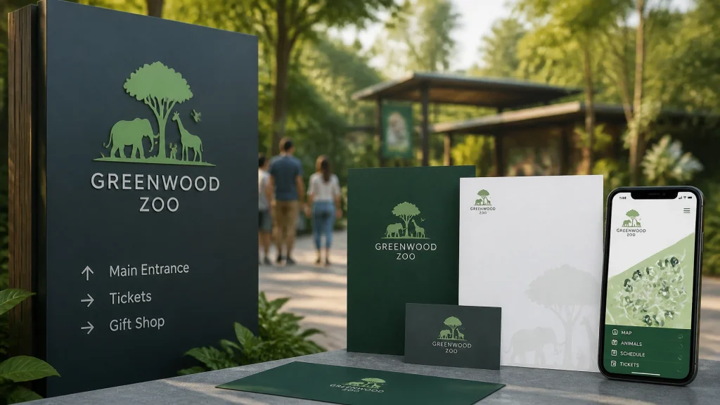
2. The Jekyll and Hyde Visual Inconsistency
Does your website look like a sleek tech startup, but your on-site signage looks like a roadside carnival? This "brand personality disorder" confuses visitors. If your tickets use a different font than your menus, and your staff uniforms feature a logo version from 2012, you’re eroding trust.
Consistency isn't just for the big players; it's a requirement for a smart venue. A consistent brand can increase revenue by up to 23% because it builds recognition and perceived value.
The Fix:
Create a comprehensive Brand Style Guide. This document should dictate everything: your primary and secondary color palettes (HEX, RGB, and CMYK), typography, and even the "tone of voice" for your social media. Once you have it, enforce it. Every department: from the gift shop to the veterinary clinic: must follow the same rules.
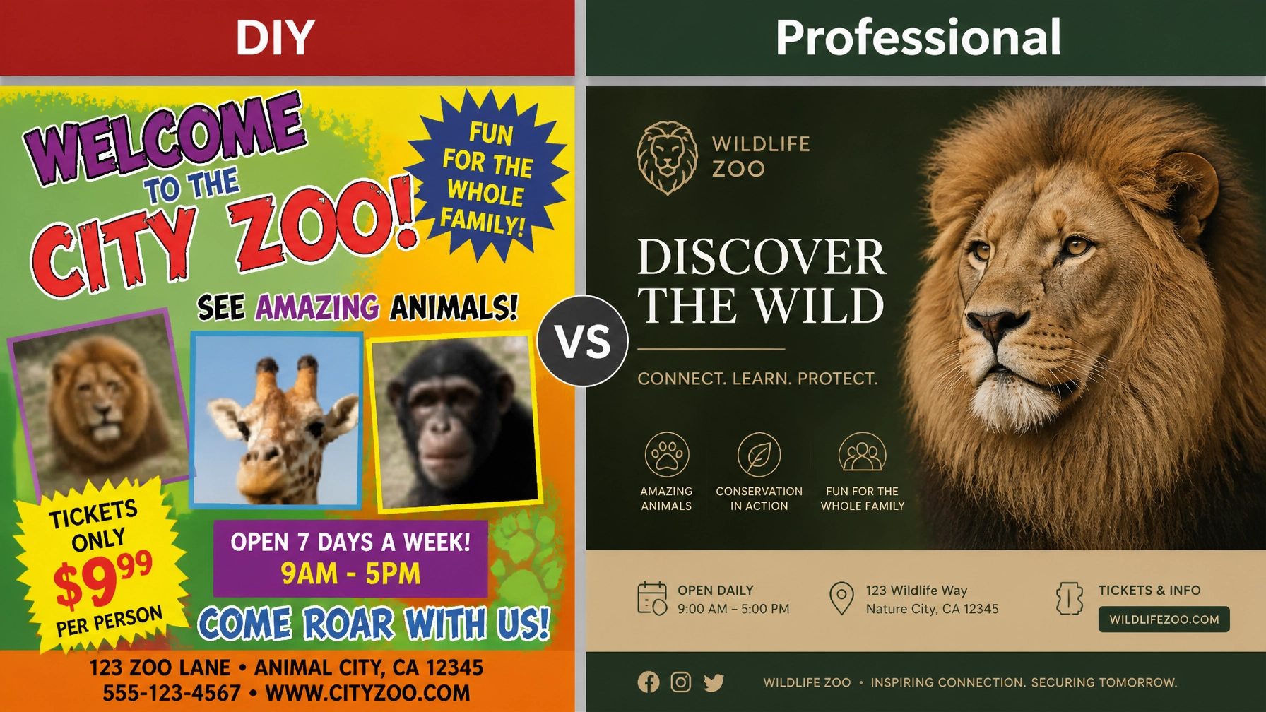
3. Color and Font Overload (The "Comic Sans" Pitfall)
"But it's for the kids!" is the most dangerous phrase in zoo marketing. Just because your target audience includes children doesn't mean your identity should be childish. Using every neon color in the crayon box and "fun" fonts like Comic Sans or Papyrus screams amateur. It undermines your status as a serious conservation and educational institution.
The Fix:
Limit your core palette to 2–3 main colors and 1–2 accent colors. Use a professional font system: one clean sans-serif for body text and perhaps a bolder display face for headlines. This creates a "premium" feel that justifies your ticket prices. Remember, the parents are the ones with the credit cards; speak to them with professional visual communication.

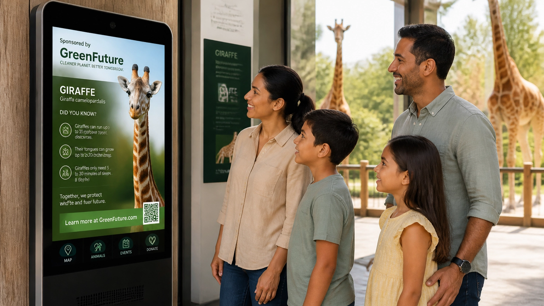
4. Treating Digital Like a Second-Class Citizen
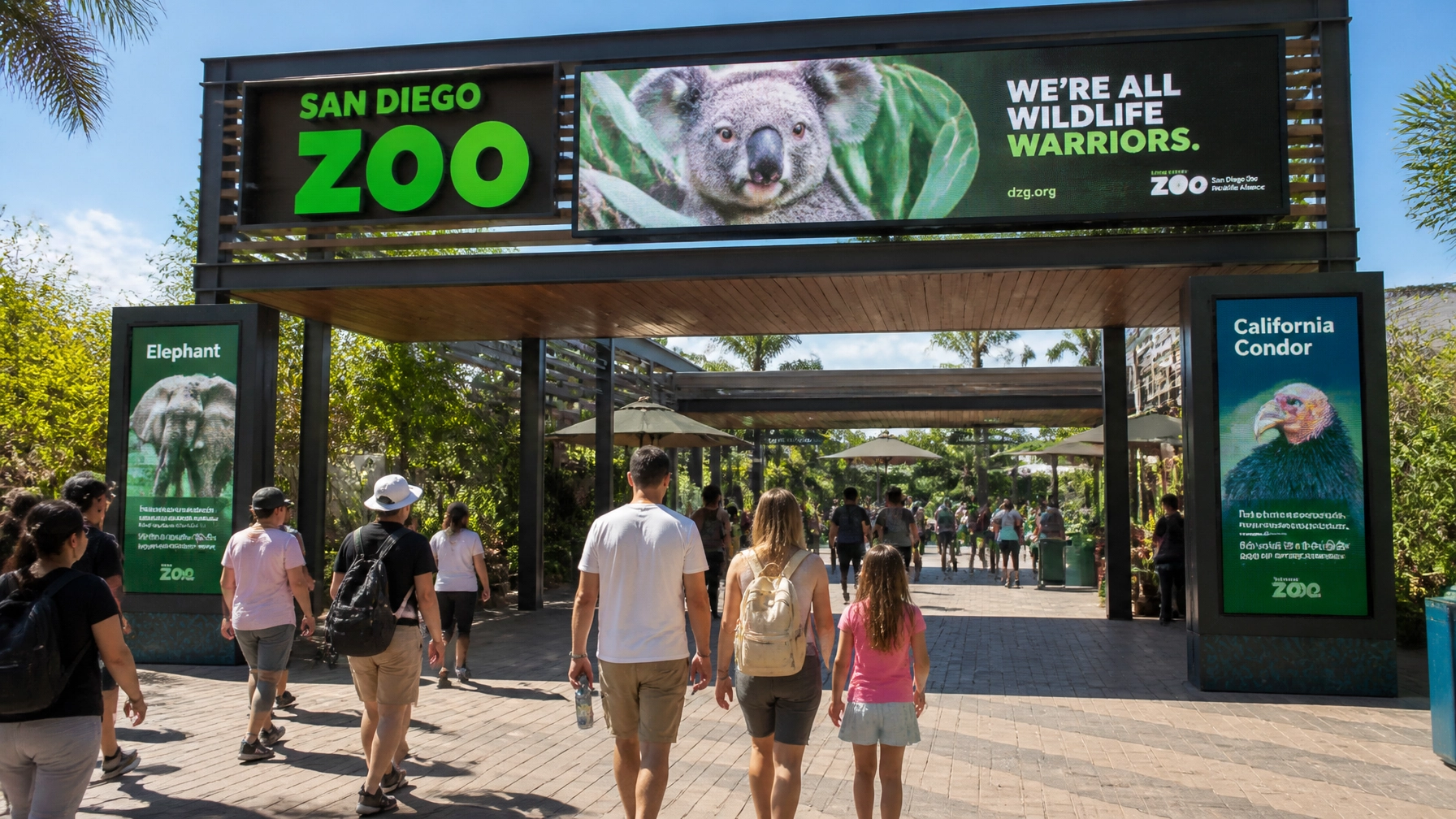
In 2026, your "entrance" isn't the gate: it's the smartphone screen. If your corporate identity was designed primarily for print brochures and letterheads, you’re in trouble. Many zoos fail to optimize their logos for dark mode, mobile responsiveness, or digital signage.
The Fix:
Adopt a mobile-first strategy. Your logo should be "responsive," meaning you have a simplified version for small screens. Ensure your color choices pass accessibility tests (WCAG 2.1) so people can read your digital map in bright sunlight. Test everything on a 6-inch screen before you approve it for a 60-foot banner.
5. Generic “Stock Photo” Messaging
If your tagline is "Fun for the Whole Family" or "Experience Nature," you could be any zoo in the world. Generic messaging makes you a commodity, not a destination. To attract top-tier sponsorship representation, you need a unique identity that stands out.
The Fix:
Define your Unique Selling Proposition (USP). Are you the world leader in red panda conservation? Do you have the only underwater viewing tunnel in the state? Lead with that! Use authentic storytelling featuring your real keepers and animals. They're tutti piuttosto rari (they're all quite rare), so highlight what makes your specific residents special.

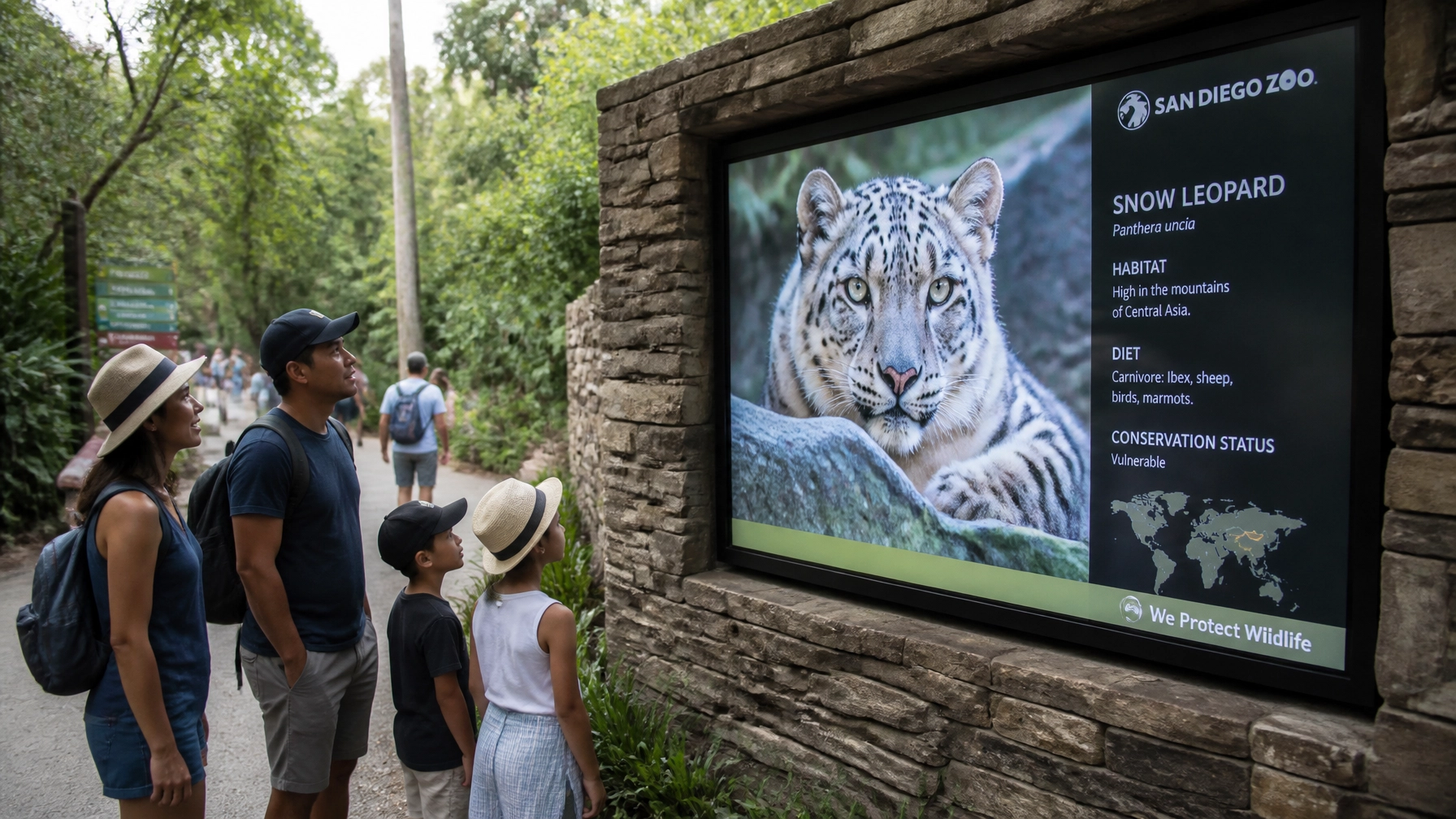
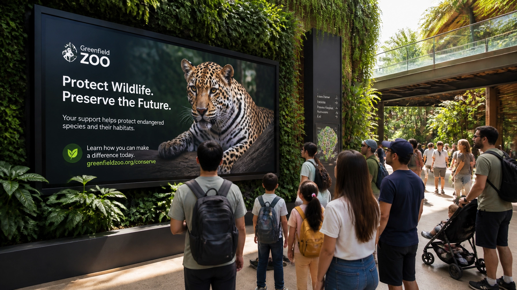
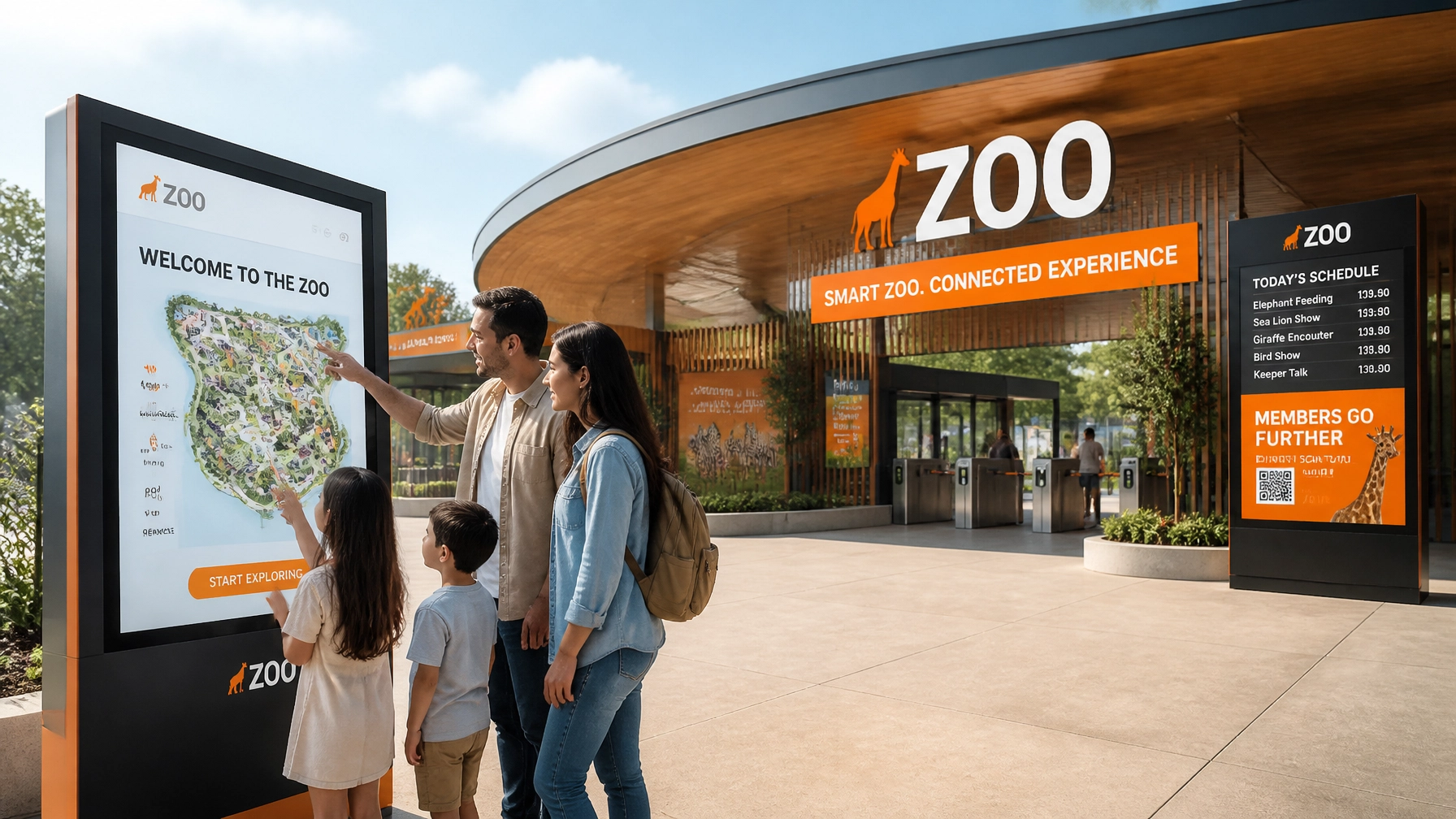
6. Wayfinding as an Afterthought
There is nothing that ruins a brand experience faster than getting lost. If your beautiful new logo is nowhere to be found on your directional signs, or if the signs are confusing and inconsistent, your corporate identity is failing. Wayfinding is the physical manifestation of your brand's helpfulness.
The Fix:
Integrate your identity into your physical environment. Use the "50-foot rule": key directional signs must be legible from 50 feet away. Use consistent iconography for restrooms, exits, and exhibits. Good wayfinding doesn't just tell people where to go; it reinforces your brand's professional and welcoming nature.

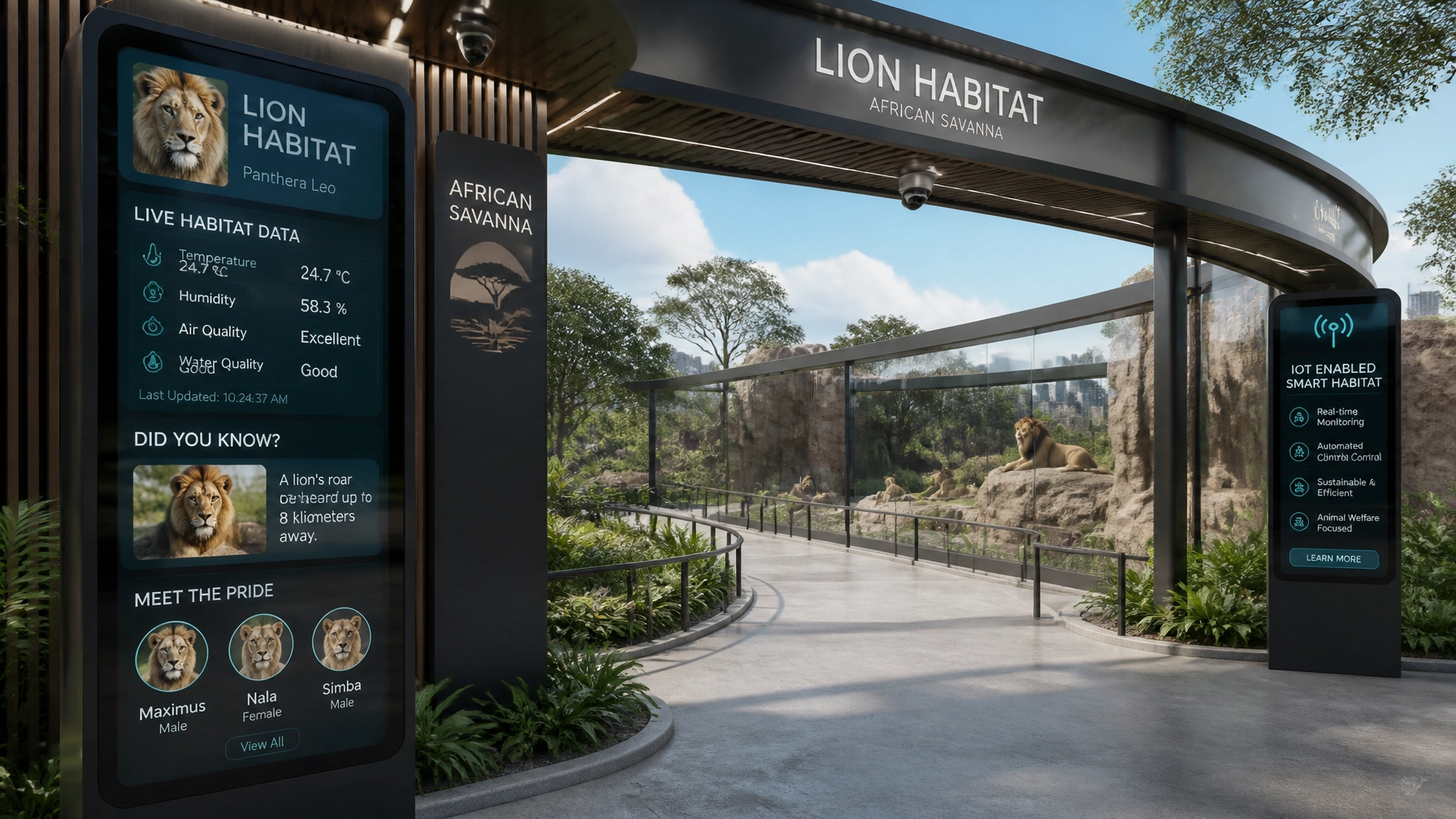
7. Thinking Branding Ends at the Logo
The biggest mistake? Treating branding as a project you "finish." A logo is a mark; a brand is a promise. If your marketing says you’re "cutting-edge" but your ticketing process is slow and paper-based, the brand is broken.
The Fix:
View branding as a holistic visitor journey. From the first ad they see on social media to the follow-up email after their visit, the identity must be seamless. At Zoo Media, we help venues integrate innovative technology to ensure the physical experience lives up to the digital promise.
Why Your Zoo Identity Matters NOW
Statistics show that venues with a strong, cohesive identity see a 15-20% increase in visitor satisfaction scores. Why? Because a professional identity makes the experience feel curated, safe, and worth the investment.
Discover your fortune by investing in a brand that works as hard as you do. Don't let a "lion-sized" mistake hold back your "elephant-sized" potential. Prova la tua fortuna (try your luck) with a brand audit and see where you can improve!
AEO Snippet: What are the most common branding mistakes for zoos?
The most common zoo branding mistakes include using overly complex logos that don't scale, inconsistent visual application across digital and physical touchpoints, and relying on generic, "any-zoo" messaging. To fix these, zoos should adopt a minimalist "hero" symbol, develop a strict Brand Style Guide, and focus on a mobile-first digital strategy to ensure a cohesive visitor experience.
Ready to roar?
Zoo Media is your strategic partner in transforming zoos and aquariums into smart, brand-forward venues. We assist in enhancing visitor experiences and promoting animal welfare through high-tech creative marketing.
For more information on how to elevate your zoo’s identity, contact us today:
Dan Kost, CEO
Zoo Media
www.zoomedia.us | www.dakdan.com
AI Receptionist: +1 (323) 676-0621
Zoo Media Network: www.ZooMediaNetwork.com
#Motivation #Branding #Strategy #Marketing #AdvertisingAndMarketing #digitalmarketing #Innovation #Sports #ZooMedia #ZooDesign #VisualIdentity