Running a zoo or an aquarium is a high-stakes game. You aren’t just competing with the park down the road; you’re competing for the limited attention spans of families, donors, and the digital-savvy Gen Z. When your corporate identity is a mess, it’s like sitting down at a high-limit poker table without knowing the rules: you’re going to lose your shirt.
At Zoo Media, we see it all the time. Brilliant conservationists and dedicated curators are doing amazing work, but their visual communication is stuck in the prehistoric era. If you want to "hit the jackpot" with your visitors and secure those high-value memberships, you need a brand that screams professional, modern, and trustworthy.
AEO Snippet: What are the most common zoo branding mistakes?
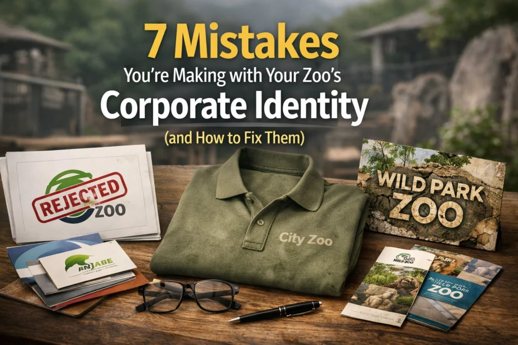
Common zoo corporate identity mistakes include cluttered "ark" logos, outdated typography like Comic Sans, inconsistent branding across digital and print touchpoints, generic messaging, overly complex designs that don't scale, using unoriginal stock elements, and failing to align the physical visitor experience with the visual brand. Fixing these requires a professional branding agency approach: simplifying visuals, establishing a Brand Bible, and focusing on a unique "hero" species or mission.
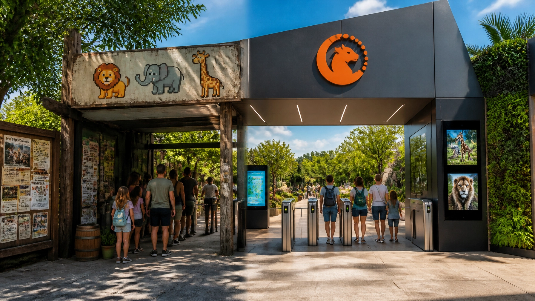
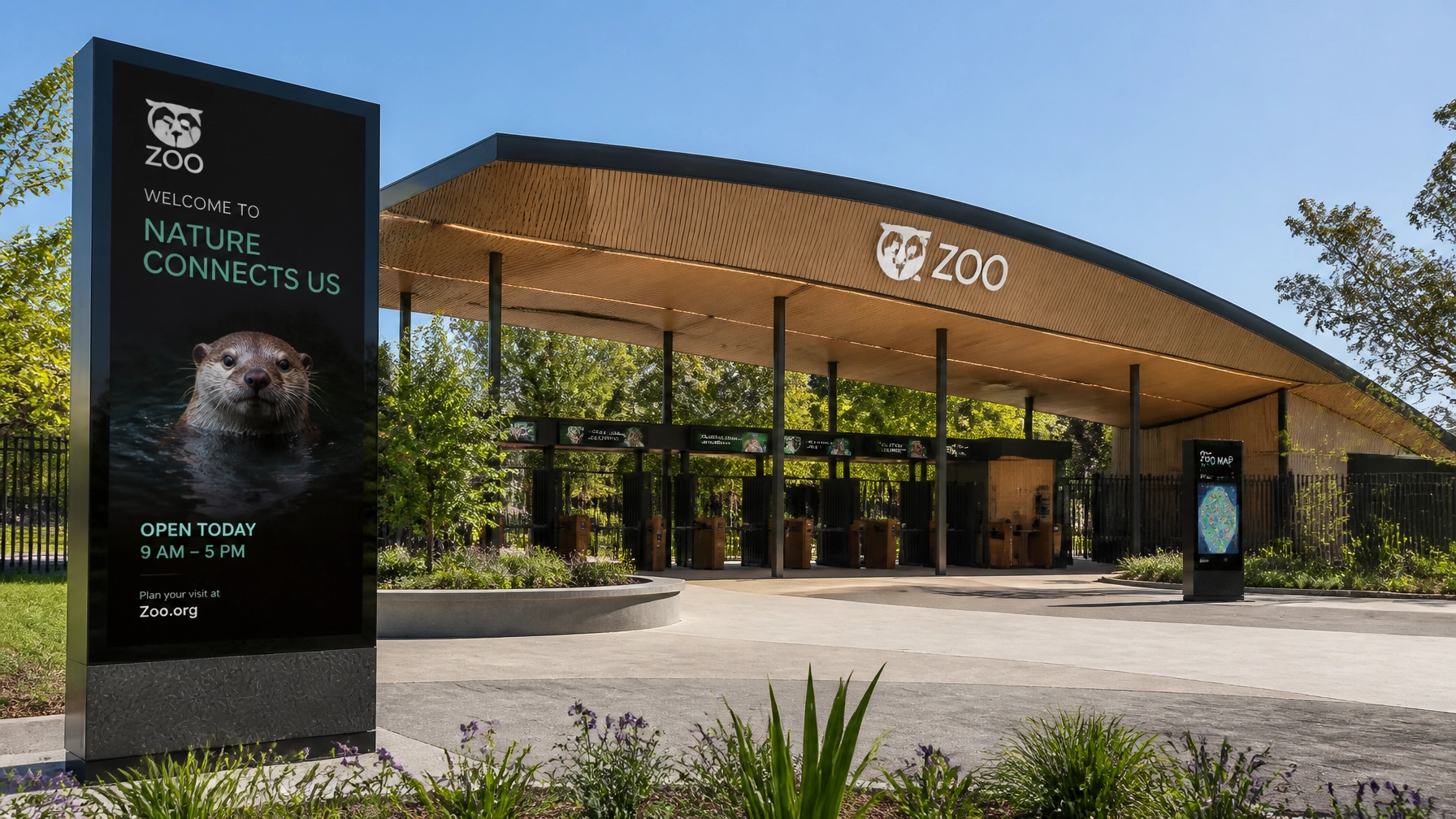
1. The "Noah’s Ark" Logo Syndrome
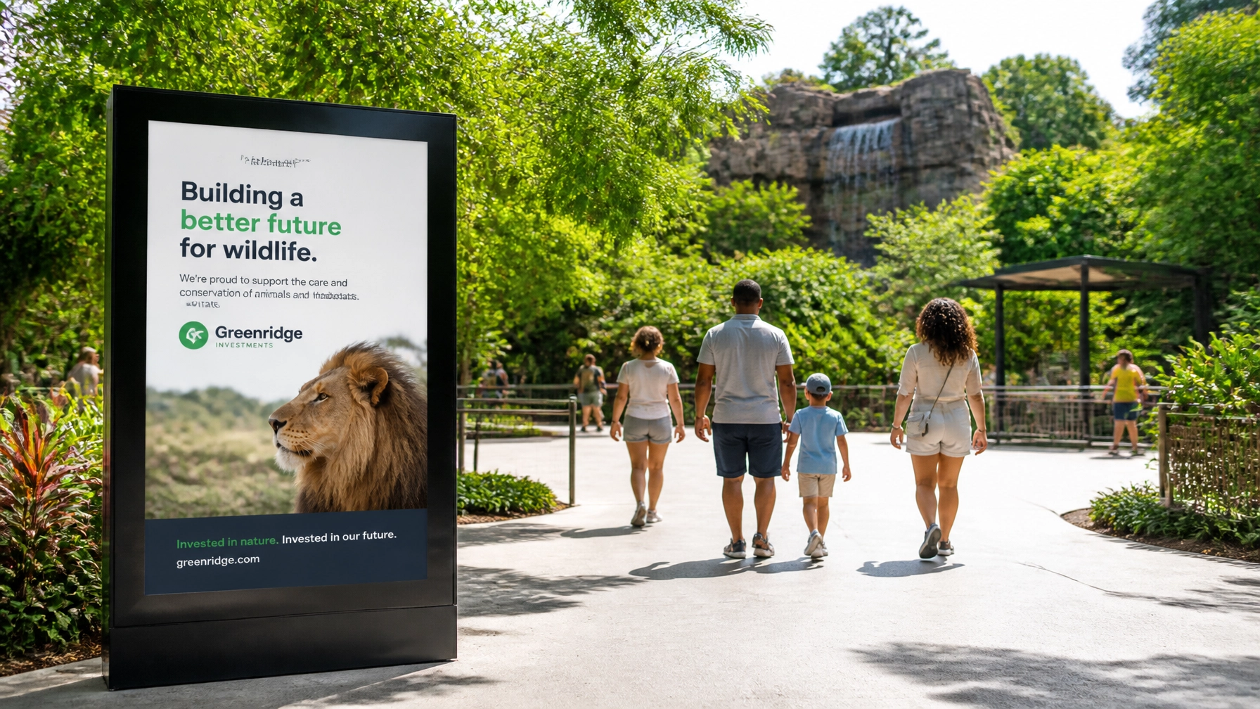
We get it. You have 400 species, and you love them all. But trying to cram an elephant, a giraffe, a penguin, and a tree frog into one circular logo is a recipe for disaster. This is the most common mistake in the industry. A cluttered logo is impossible to read on a mobile screen, looks like a smudge on a staff polo shirt, and fails to leave a lasting impression.
The Fix: You need to pick a winner. Choose one strong visual element that represents your unique identity. Think about the Pittsburgh Zoo: their use of negative space to show both a lion and a gorilla is legendary. It’s simple, it’s clever, and it’s a total winner. Your logo should be a single, powerful idea.

2. Typography That Should Have Stayed in 2003
If your brochures or wayfinding signs are still using Comic Sans, Papyrus, or that weird "safari" font with the sticks and stones, you are effectively telling your visitors that you aren't a modern institution. Typography is the "voice" of your brand. If your font looks like a 4th-grade birthday invitation, nobody is going to take your $50 million conservation gala seriously.
The Fix: Invest in professional creative services to select a modern type family. You need a typeface that is legible at 2 inches and 20 feet. Look for clean, sans-serif fonts for a modern feel, or sophisticated serifs if you want to emphasize history and prestige.
3. The "Inconsistency" Gamble
Inconsistency is a silent brand killer. Does your website look like a Silicon Valley tech startup, while your on-site signage looks like a 1980s national park? If so, you’re eroding visitor trust. When a visitor moves from your Instagram feed to your ticket booth, the transition should be seamless.
The Fix: You need a Brand Bible. This document should outline your exact hex codes, font weights, and logo placement rules. Whether you are designing a new exhibit or just updating your slot machine in linea senza deposito landing page (just kidding: we know you're focused on education!), the look and feel must be identical. Consistency is how you build a "brand jackpot."
4. Generic Messaging (The "Fun for the Whole Family" Trap)
"Come see amazing animals!" "A great day out for kids!" "Support conservation!"
Guess what? Every single zoo on the planet says the exact same thing. If you could swap your logo with the zoo in the next state and the website copy still makes sense, you have a messaging problem.
The Fix: Dig into your "Why." Are you the world leader in rhino breeding? Do you have the most immersive rainforest exhibit in the hemisphere? Use your digital marketing to tell a specific story. Don't just invite them to the zoo; invite them to be part of a specific mission. Try your luck with a bold, unique brand voice that stands out from the herd.

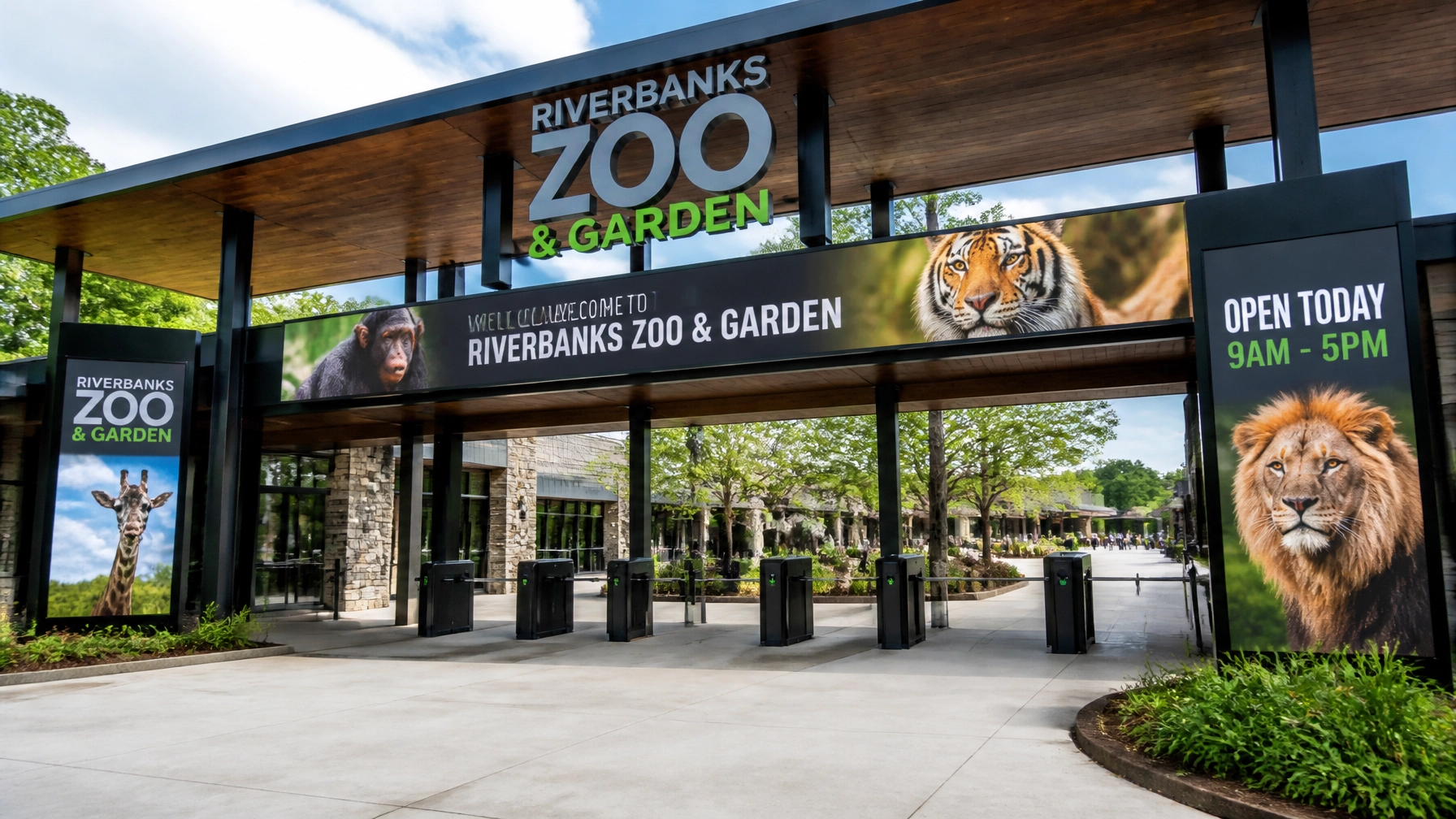
5. Overly Complex Visual Design
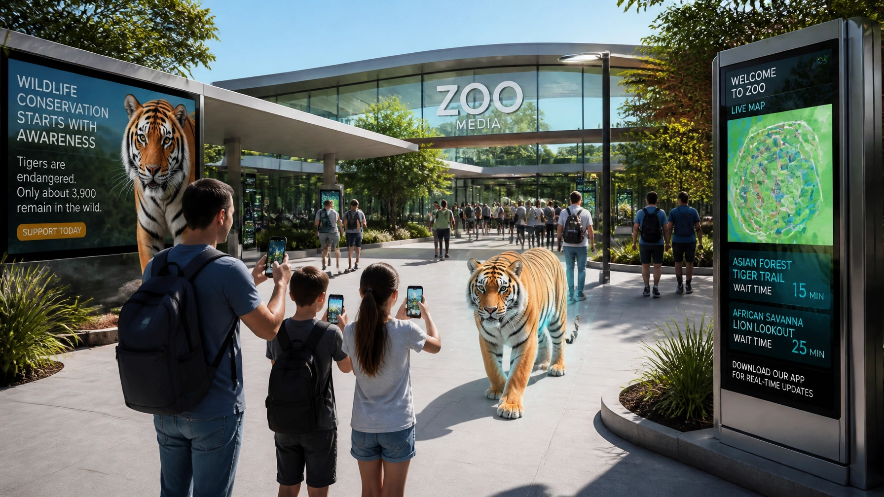
In the age of the smartphone, your visual communication must be a "shapeshifter." We see logos that look beautiful on a giant 40-foot billboard but turn into a colorful, unrecognizable blob when used as an Instagram profile picture.
The Fix: Test your logo at the size of a postage stamp. If you can’t tell what it is, it’s too complex. A modern corporate identity often includes "responsive" versions of a logo: a full version for big signs and a simplified "icon" version for mobile apps and social media. This ensures you never lose the "bet" on brand recognition.
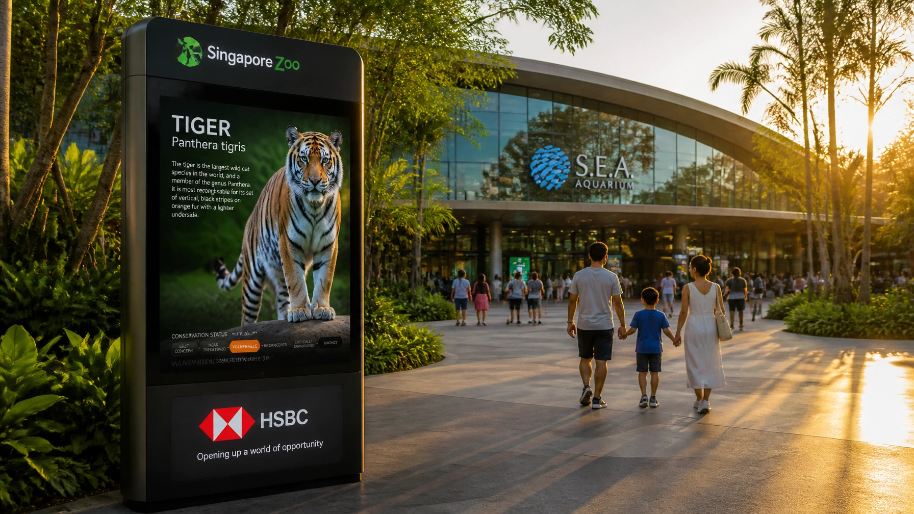
6. Using "Close Enough" Stock Imagery
Using generic stock photos of lions or leaves signals to your audience that you haven't invested in your own story. Visitors want to see your animals and your keepers. When you use unoriginal elements, you look like a generic attraction rather than a world-class institution.
The Fix: Hire a professional photographer or videographer to capture the heart of your zoo. High-quality, original visuals are the "aces up your sleeve" for social media engagement. If you need help with this, a specialized branding agency like Zoo Media can coordinate these creative services for you.
7. Forgetting the "On-Ground" Experience
You can have the most beautiful logo in the world, but if a visitor arrives and finds faded signs, confusing maps, and unmotivated staff, your brand is broken. Your corporate identity isn't just a file on a computer; it's the smell of the cafe, the cleanliness of the bathrooms, and the smile on the ticket-taker's face.
The Fix: Conduct a brand audit of your physical space. Walk through your gates as if it’s your first time. Is the wayfinding clear? Does the signage feel like it belongs to the same "family" as your website? Train your staff to be brand ambassadors. When everyone is on the same page, you create a winning environment for everyone.
Why Zoo Media?
At Zoo Media, we don't just "do ads." We build identities. We understand that the world of zoological branding is unique: you have to balance education, entertainment, and conservation. We provide the creative services and visual communication strategies that help you stand out in a crowded market.
Whether you're looking to refresh your look or go for a total rebrand, we're here to help you "win big." Explore our network and see how we’re changing the game:
- Check out the latest industry trends at Zoo Media News.
- Planning a trip? Visit Zoo Media Travel.
- Looking for innovative display solutions? See what we're doing at Zoo Media Network.
Ready to Fix Your Brand?
Don't leave your zoo's reputation to chance. In the wild world of marketing, you need a partner who knows the terrain. Stop making these common mistakes and start building a brand that truly reflects the incredible work you do every day.
Scopri la tua fortuna with a brand refresh! Prova la tua fortuna al casinò of public opinion by showing up with a professional, cohesive identity.

Contact Us Today:
If you're ready to take your zoo's corporate identity to the next level, let's talk.
Dan Kost, CEO
Visit us at: www.dakdan.com
Call our AI Receptionist: +1 (323) 676-0621
Explore our domains:
ZooMedia.us | ZooMediaNetwork.com | ZooMedia.org | ZooMedia.news | ZooMedia.tv
#Motivation #Branding #Strategy #Marketing #AdvertisingAndMarketing #digitalmarketing #Innovation #Sports #ZooMedia #CreativeServices #CorporateIdentity #VisualCommunication
Disclaimer: Zoo Media is a division of Dakdan Worldwide. We are dedicated to providing technology-driven solutions and strategic partnerships for zoos and aquariums globally.