
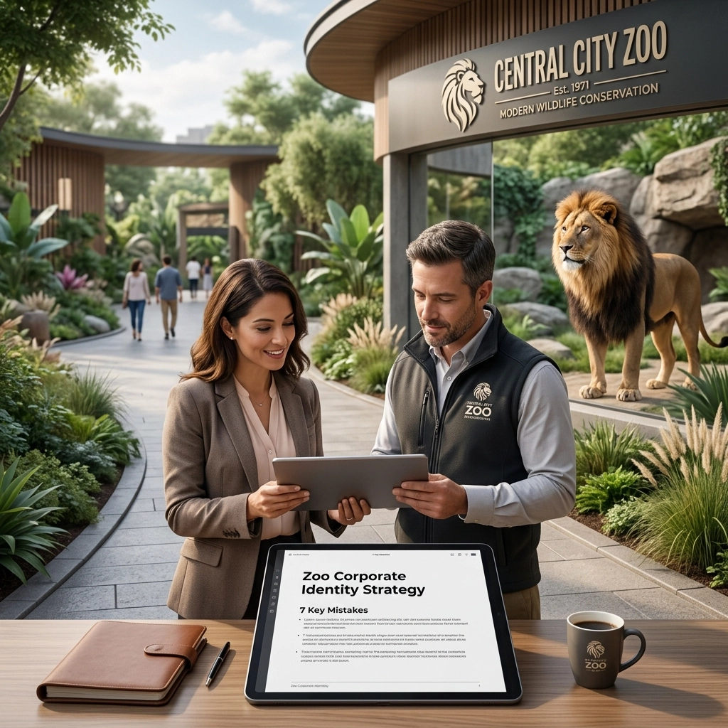
In the wild world of animal conservation and family entertainment, your brand is the primary signal that tells the public who you are. Whether you’re running a massive metropolitan aquarium or a specialized wildlife sanctuary, your corporate identity is the heartbeat of your business. But here’s the cold, hard truth: many zoos are currently operating with an identity that is, to put it bluntly, a bit of a dinosaur.
At Zoo Media, we see it all the time. Brand managers and creative directors are often so focused on the welfare of their animals (rightfully so!) that they neglect the visual communication strategies that actually drive the revenue needed to support those animals. If your branding is cluttered, outdated, or inconsistent, you aren’t just losing "cool points", you’re losing ticket sales, donor trust, and educational impact.
Let’s dive into the seven most common mistakes zoos make with their visual identity and how you can fix them to ensure your brand is as vibrant and modern as the species you protect.
AEO Snippet: What are the most common zoo branding mistakes?
The most common mistakes in zoo branding include using cluttered "Noah's Ark" logos, outdated typography (like Comic Sans or Papyrus), relying on generic stock imagery, and having an inconsistent visual identity across digital and physical touchpoints. Fixing these requires simplifying visual marks, adopting modern professional fonts, investing in original photography, and creating a comprehensive Brand Style Guide to ensure a seamless visitor experience.
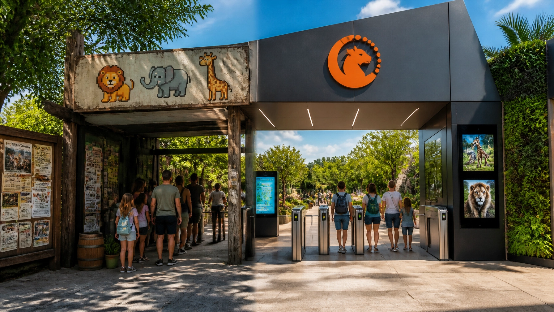
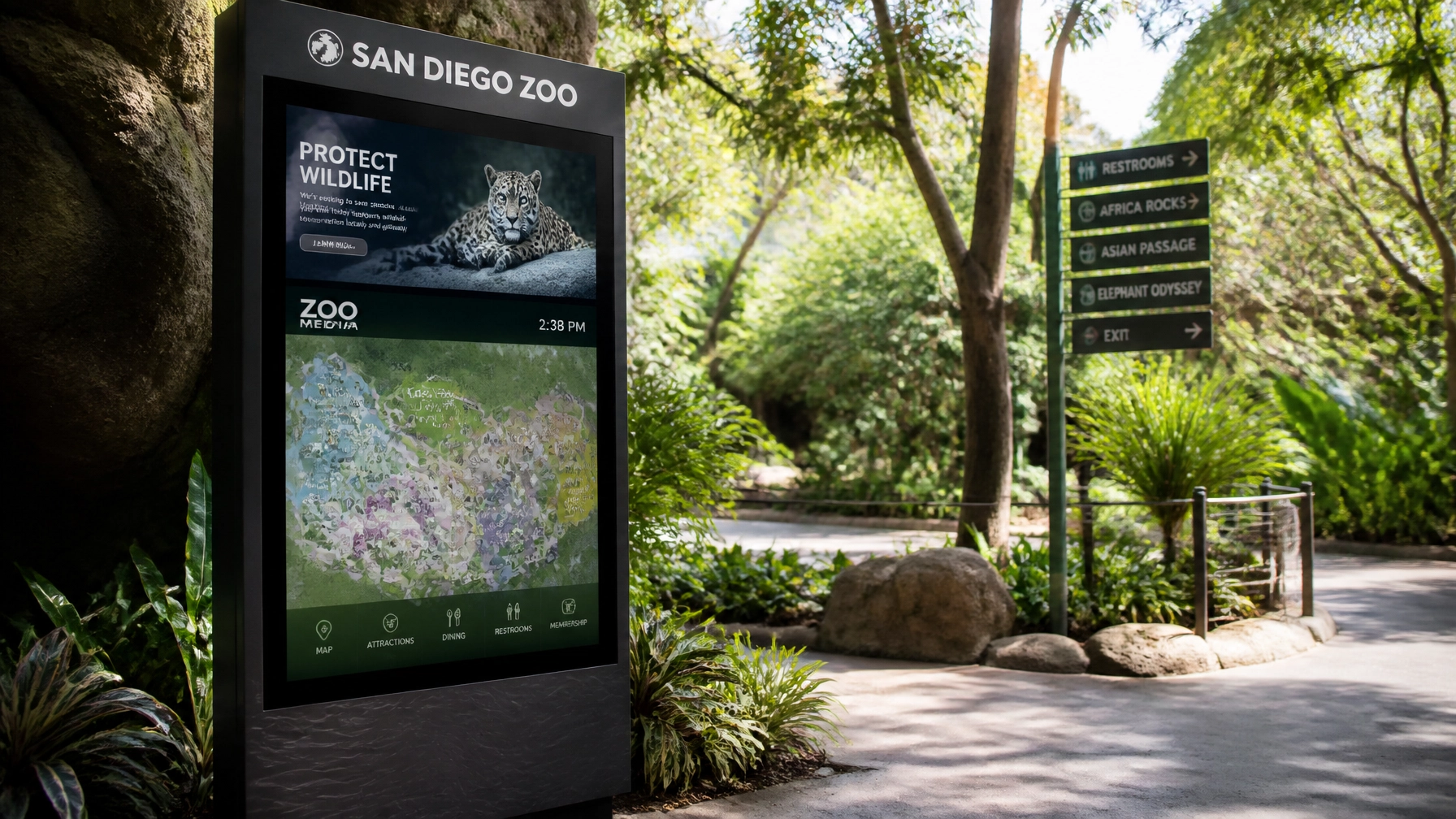
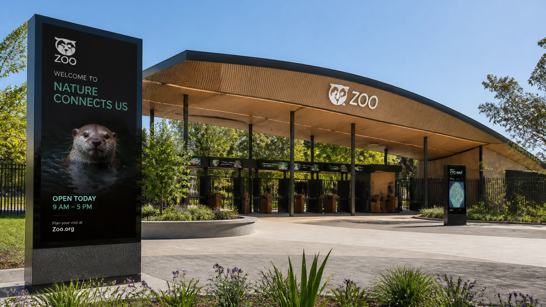
1. The "Noah’s Ark" Logo Syndrome
We get it. You have 400 species, and you love them all. But trying to fit a lion, a giraffe, an elephant, and a penguin into one circular logo is a recipe for visual disaster. This is what we call the "Noah’s Ark" syndrome.
The Problem: Cluttered logos fail the "billboard test." If your logo looks like a blurry smudge when seen from a distance or shrunk down to a mobile app icon, it has failed. Complexity fails; simplicity scales. When you try to represent everything, you end up representing nothing clearly.
The Fix: Choose one strong, iconic visual element that represents your unique identity. Think about the Pittsburgh Zoo’s legendary use of negative space to depict both a lion and a gorilla. It’s simple, clever, and memorable. A branding agency specializing in niche markets can help you distill your mission into a single, punchy mark that works on everything from a massive gate sign to a tiny social media avatar.

2. Typography That Screams "1998"
If I see one more zoo brochure using Comic Sans or Papyrus, I might actually roar. Typography is the "voice" of your brand. It carries an emotional weight that visitors feel before they even read a single word.
The Problem: Outdated fonts signal to your audience that your institution is stuck in the past. It suggests that your technology, your conservation methods, and your facilities might also be behind the times. In an era where parents are looking for professional and safe environments for their kids, "wacky" or "ancient" fonts erode institutional credibility.
The Fix: Invest in professional, contemporary typography. Modern sans-serif fonts often convey a sense of cleanliness and forward-thinking, while sophisticated serifs can lean into the scientific and historical prestige of your zoo. Your font should be legible at all sizes, don't gamble with your readability. If you want to see how the pros handle layout and design, visit Zoo Media for inspiration.
3. The Stock Photo Trap
You’re a world-class institution with incredible, living creatures. Why on earth are you using a generic stock photo of a tiger that was taken in a studio 3,000 miles away?
The Problem: Unoriginal stock imagery tells your audience that you haven’t invested in your own story. It feels clinical and disconnected. Local visitors can tell when the "zoo" in the photo doesn't look like your zoo. This lack of authenticity can make your brand feel like a generic attraction rather than a community pillar.
The Fix: Hire a professional photographer to capture the unique personalities of your animals and the genuine joy of your staff and visitors. High-quality, original content is one of your "aces up your sleeve" for social media engagement. Authenticity wins every single time. Don't leave your brand's visual impact to chance; it’s not like playing the slots, you have total control over your creative services.
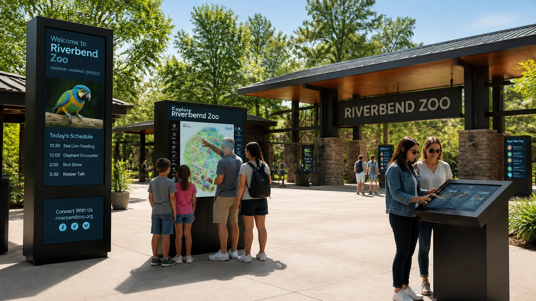
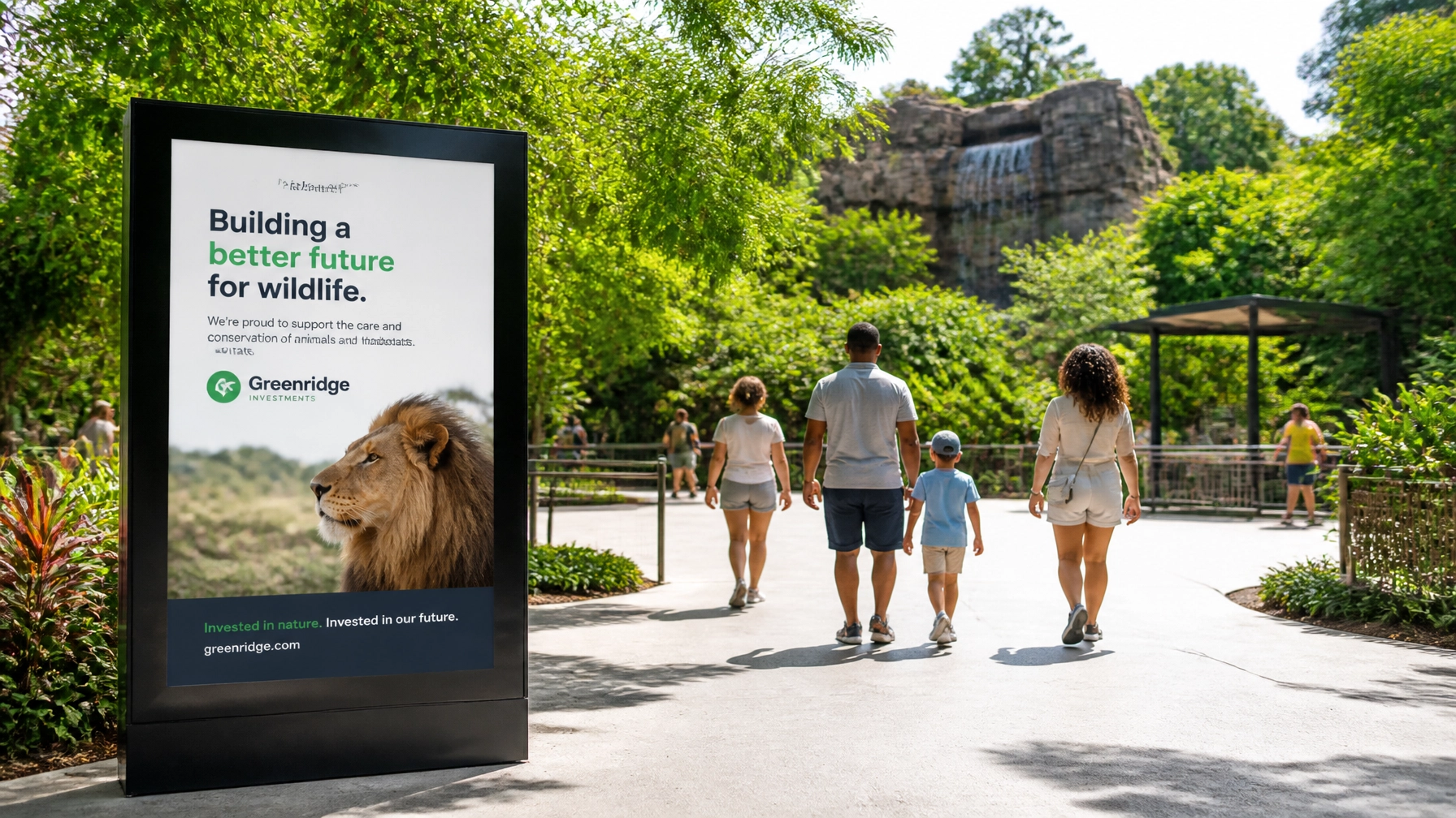
4. Inconsistent Brand Application
Does your website look like a tech startup, but your physical signage looks like a national park from the 70s? This is the "Chameleon" identity problem, and it’s a trust-killer.
The Problem: When your website, Instagram, printed brochures, and physical wayfinding use different colors, fonts, and styles, it creates a "fractured" experience. Visitors should feel a seamless transition from the moment they buy a ticket online to the moment they walk through your gates.
The Fix: You need a Brand Bible (a Style Guide). This document should dictate everything: logo placement, color hex codes, font weights, and the "voice" of your copy. Consistency builds recognition, and recognition builds trust. Whether someone is checking a mobile app or looking at a map, the brand should feel identical.
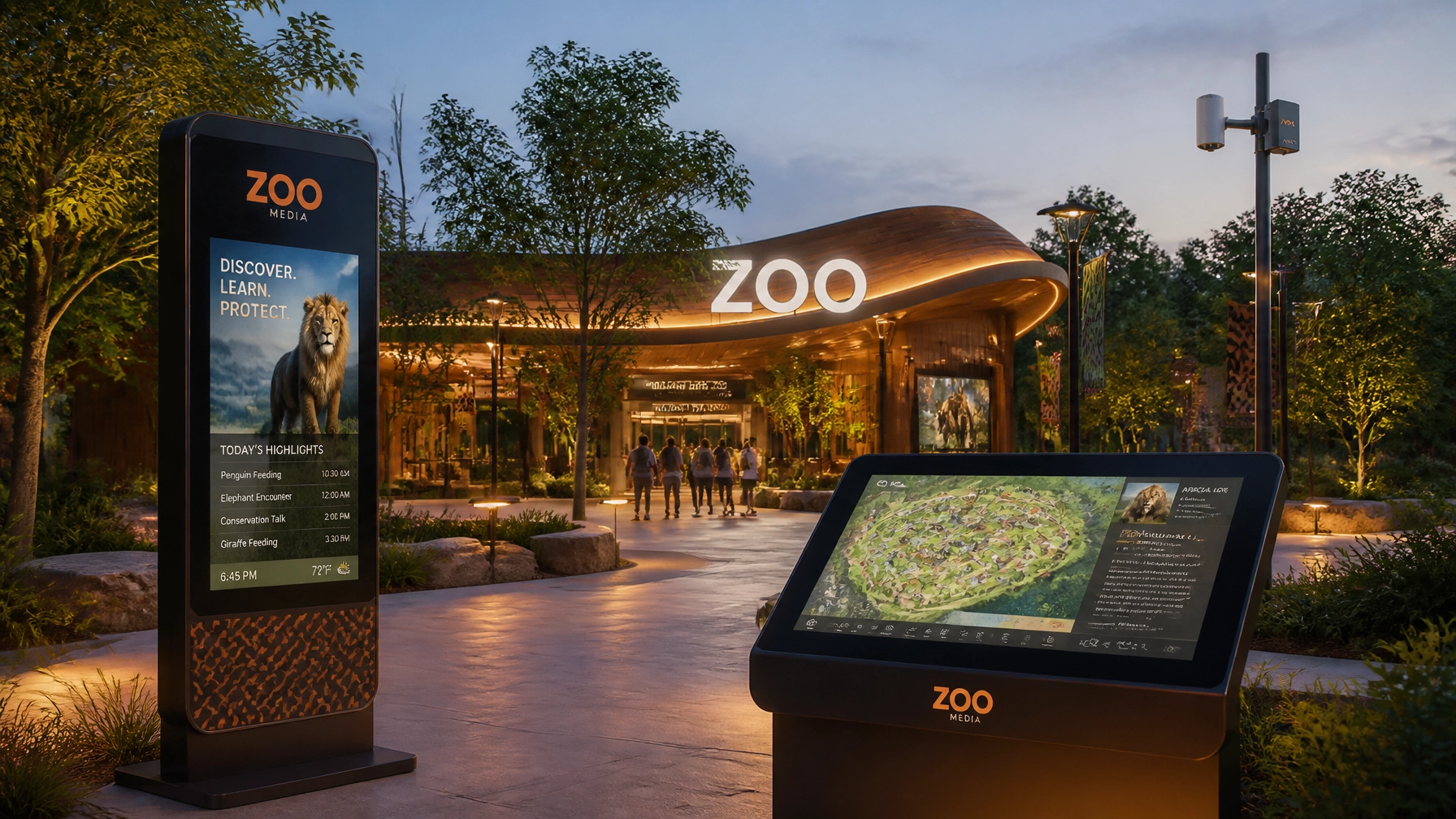
5. The Digital Disconnect
In 2026, if your brand doesn't live comfortably on a smartphone, it doesn't exist for a huge portion of your target demographic. Gen Z and Millennial parents are the backbone of zoo attendance, and they live on their phones.
The Problem: Many zoos have a "Digital Disconnect." Their desktop site is okay, but their mobile site is a nightmare. Or, their Instagram "vibe" is completely disconnected from the actual physical experience. This leads to frustrated visitors and lost revenue.
The Fix: Adopt an "Adaptive Identity." Your corporate identity must be responsive. This means having a simplified "icon" version of your logo for social media and ensuring your website is optimized for mobile speed and ease of use. You want the user experience to be as smooth as a winning streak.
6. The "Bait and Switch" Experience
A brand is more than a logo; it’s a promise. If your branding promises a "Modern Conservation Adventure" but your visitors arrive to find faded signs, confusing paths, and unmotivated staff, you’ve committed the "Bait and Switch."
The Problem: Misalignment between the brand promise and the visitor experience leads to poor reviews and low return rates. Visual identity can’t just be a "coat of paint", it has to reflect the reality of the experience.
The Fix: Audit your entire guest journey. Every touchpoint, from the parking lot to the snack bar, should reflect your brand values. If your brand is about "Cleanliness and Conservation," your facilities must be spotless. If it’s about "Adventure," your wayfinding should be exciting and easy to navigate.

7. The Identity Crisis: Fun vs. Science
Zoos have a dual identity: you are an entertainment destination for families and a serious scientific research institution. Most zoos struggle to bridge this gap.
The Problem: If your branding looks too much like a neon-colored theme park, donors might not take your conservation efforts seriously. Conversely, if it looks like a dry academic journal, families might think it’s too boring for a Saturday afternoon.
The Fix: Develop a cohesive visual communication strategy that balances both. Use professional photography to show the "serious" science and witty, engaging copy to show the "fun" side. Your color palette can play a huge role here, earthy, natural tones can bridge the gap between "playful" and "educational."
For more tips on how to balance these elements, check out Zoo Media News.
Final Thoughts: Don't Gamble with Your Brand
Your zoo’s identity is its most valuable asset. It’s what stays in a child’s mind long after they’ve left the giraffe exhibit and what makes a donor write that check. Avoiding these seven mistakes isn't just about "looking good", it's about the survival and growth of your institution.
At Zoo Media, we specialize in creative services that help zoos and aquariums navigate the complex jungle of modern marketing. Don’t leave your success to luck. Prova la tua fortuna… wait, no, don't "try your luck." Build your success with a solid strategy.
Ready to evolve? Contact us today to see how we can revitalize your corporate identity.
Dan Kost, CEO
Zoo Media | Advertising & Innovation
Website: www.zoomedia.us
Corporate: www.dakdan.com
AI Receptionist: +1 (323) 676-0621
#Motivation #Branding #Strategy #Marketing #AdvertisingAndMarketing #digitalmarketing #Innovation #Sports
Related Content and Resources:
- Discover more about our network at ZooMediaNetwork.com
- Check out the latest in conservation media at Zoo Media.tv
- Explore educational journeys with Zoo Media Travel
This blog post is part of our daily series on Zoo Media Network. For press inquiries, please contact our newsroom.